· · Laura Paplauskaite · 4 min read
Behind the new website and brand for think tank SEDRIC

The think tank for drug-resistant infections, SEDRIC, launched its new brand identity and website created by Bit Zesty this month.
SEDRIC is The Surveillance and Epidemiology of Drug-resistant Infections Consortium. Funded by research charity Wellcome, the think tank brings together experts from across the world to share expertise and find solutions facing the surveillance and epidemiology of drug-resistant infections.
To reflect its work and global community, SEDRIC needed a standalone brand identity and new website. From user research to branding and web development, Bit Zesty helped achieve this. The new website will allow new SEDRIC members to easily apply, enable existing members to collaborate more effectively, and, ultimately, aid the sharing of information that’s at the core of SEDRIC’s mission.
By conducting a staff workshop and user research, we were able to create a brand identity and web design that truly reflected the think tank’s membership.
“SEDRIC’s website and brand launch marks the start of a new chapter. Where previously SEDRIC could only be found on a page of the Wellcome website, SEDRIC now has a proper home online. As the global fight against drug-resistant infections continues, this is more important than ever for our community. This work not only recognises our members’ needs, it also reflects the importance of our cause globally: to fight drug-resistant infections across the world.
“Bit Zesty was the perfect agency partner for this project. Because Bit Zesty work so collaboratively, they quickly understood our goal of launching SEDRIC as its own brand, put member needs at the heart of the project, stuck to our budget and deadlines – and made my first digital project at SEDRIC reassuringly easy and enjoyable.”
Lydia Rollinson, Communications Officer at the Wellcome Trust
Read more from Lydia on SEDRIC’s website.
From starting the project in April 2019 to launching in October 2019, here’s what we did:
User research
To ensure the website met its user needs for visitors, members and the wider scientific community, we conducted initial user research.
By telephone-interviewing eight SEDRIC members, we were able to define what members wanted from the SEDRIC website as well as some of its values. Our interviews found members wanted regular updates and the ability to collaborate with other members. As a result we created a newsletter sign-up form and searchable member directory.
Later in the process, we tested all the designs with members through usability testing to ensure what we’d created met user requirements – and to make further refinements and improvements.
Brand identity creation
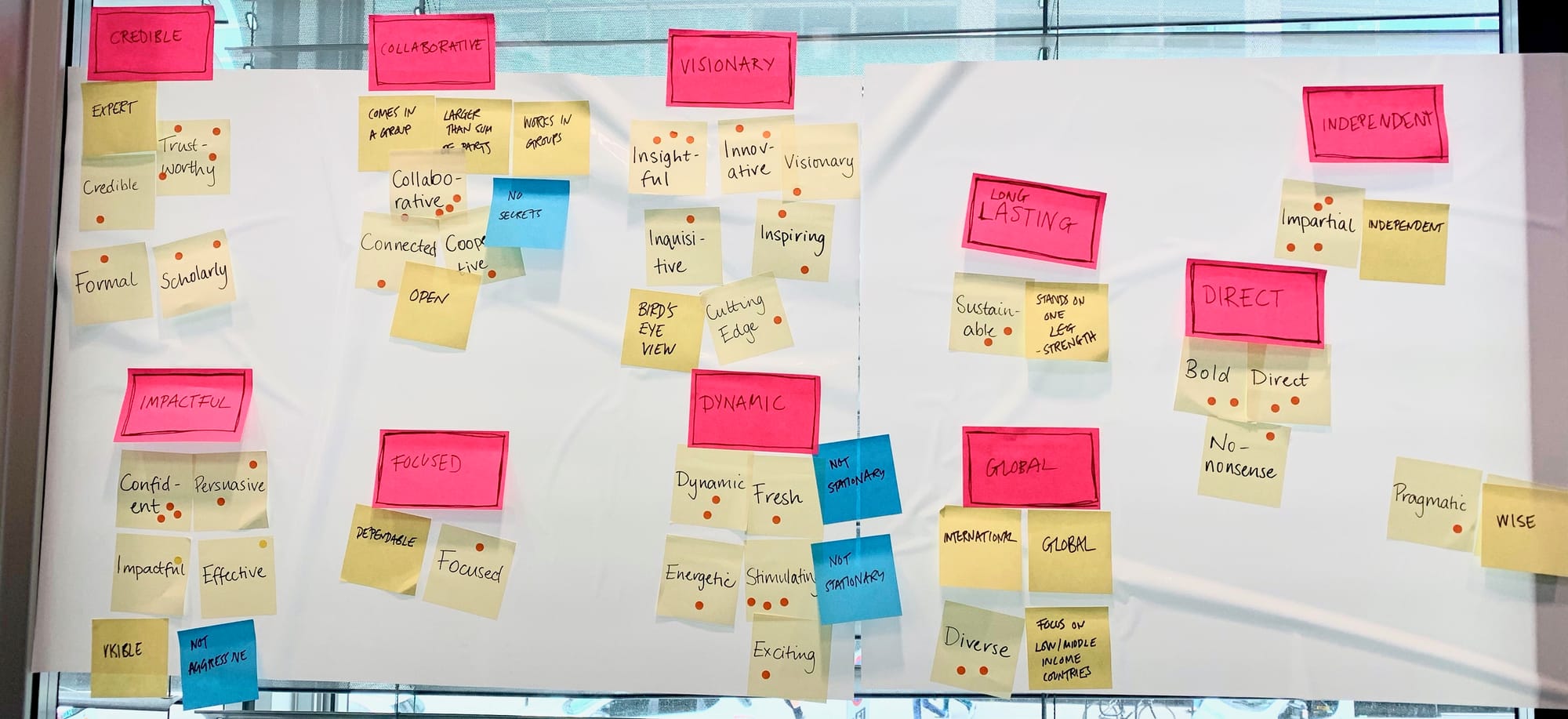
SEDRIC needed its own brand identity. Conducting a workshop with staff members, we honed the SEDRIC brand personality through various activities. (Our favourite activity was asking SEDRIC staff to choose an animal that represents the brand and say why. Interestingly, they all chose birds, using words and phrases such as ‘open’, ‘works in groups’, a ‘bird’s eye view’ and ‘visible’ to describe SEDRIC). Workshop activities like these can be a powerful way to unlock core brand values. We also worked through various adjectives to describe the brand and voted for the words that resonated most.
Following the workshop, we started to put all the research into a visual identity and design. To execute our creative ideas, we collaborated with a trusted brand designer. Purple was recognised in the workshop as a colour of credibility, so forms a prominent part of the brand’s colour palette. The ‘S’-shape logo is a conceptual image of a broken pill to reflect SEDRIC’s focus on drug-resistant infections. The angled halves also form an abstract ‘S’ – the first letter of SEDRIC’s name.
Here is an early branding palette with the logo:
Web design
The website design prioritises being simple and easy to navigate. It’s key that information about SEDRIC, published works and working groups is accessible.
Other core updates include:
- Streamlined membership application
A simple form allows visitors to apply to become a member in just a few clicks.
- Facilitation of member collaboration
Members can use the site to express interest in working groups. The introduction of a searchable member directory also allows members to make new connections.
- Regular news updates
SEDRIC now has a dedicated news section, newsletter sign-up form and integrated Twitter feed to elevate the communication of updates among visitors and members.
Web development & launch
We chose to build SEDRIC’s website on the WordPress platform. Being an established publishing platform meant staff members were comfortable with managing and publishing new content. As part of the project, we integrated SEDRIC’s existing dotMailer email marketing software. We also created a smart way to allow SEDRIC staff to approve member applications without re-entering member details to populate the search directory.
This project closely aligns with Bit Zesty’s own ethos of using expertise for good, so it’s been a pleasure to work with the team at SEDRIC to achieve its goals.
From user research to web and application development, find out how our experts can help with your next project. Get in touch or message us on Twitter, Facebook or LinkedIn.
Do you need help with your application?
At Bit Zesty, we specialise in building and maintaining bespoke software and integrating AI into existing applications.
Looking to build an application, but unsure of the price? Keen to discuss our experience, processes and availability?


