· · Laura Paplauskaite · 4 min read
Search UX: Improving Search Form UX

The search facility is one of the primary ways in which users interact with a website. When search form UX is implemented successfully, anyone should be able to quickly and easily find the information they’re looking for among the wealth of data a website contains.
Unfortunately, organisations generally struggle to keep up with users’ expectations in this area. Many still have a relatively basic search facility (or none at all) and this is frequently quoted as one of the most frustrating issues by end users. When thinking about search form UX, you need to plan data architecture and make sure that the most appropriate search engine is used. Optimisation to make your search results more accurate is an ongoing process – Google has been doing it for years and is still improving. However, this blog post will focus on search form UX from the interface design perspective, rather than the search results or technical aspects. Here are some basic rules that should be followed in order to make your search facility more user friendly:
1. Make it easy to find.
Typically users expect the main site search to be placed at the top of the page, either in the middle, as with Amazon:

or on the right, as with the UK Government site:

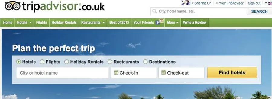
Also, if search is one of the main ways for users to navigate the site, consider placing it in the middle of the area above the fold like Tripadvisor:

And, of course, Google does it like that as well:

Make sure you have a “Search” or “Go” button to aid users.
2. Have an auto-complete feature where, as the user types in data, a list of suggested items is displayed.
This not only speeds up the searching, but also ensures that the input exactly matches the way data is stored in the system, thus enhancing the search results.

On the above site, if a user starts typing “evening”, the search box suggests “evening dress” and “evening maxi dress”. These are better matches than “evening gown”, which a user might have typed if the auto-complete feature was not available. ASOS goes a bit further and even indicates to the user how many items there are in each search term, a feature which is particularly useful for e-commerce sites.
3. Ideally make your search as similar to Google as possible.
Your users are used to that and expect search forms to act similarly. If it is different, explain to users how your search works. For example the Airbnb search expects user to enter location, so the search box clearly asks “where do you want to go?”

This prevents the user from entering irrelevant search terms. In BBC Food’s recipe search (which is different from their high level site search on the top right), the search area is labelled as “Quick recipe finder” and the box asks “Type ingredients, chef or programme”.

4. Help users to get more relevant search results by adding select options to basic search.
On iStockphoto, you can conveniently select if you want to search all files or only for photos or illustrations.

If you have more than one select option, you may consider creating a mini search form on the site, the way Toptable do.

If you do this, it’s advisable to limit the form to seven items including the search field and button.
5. If you have a lot of data or if your search facility acts as a report creator, provide an advanced search and make it easy to find.
Google has an advanced search but you need to know about it, so the majority of users don’t take advantage. LinkedIn, on the other hand, have a simple but clear link to their advanced search.

It goes without saying that the advanced search form fields have to be clearly labelled.
In this blog post, I’ve tried to capture the most important aspects of search form UX, but there is so much more to consider when designing your search. Future posts in this series will cover practices for filtering and organising results, what to do when search returns no results, and the data that should be displayed with each search result.
Do you need help improving your UX? Contact Matthew, our Technical Director, today on +44 207 125 0160 or drop him a line on matt@bitzesty.com for a free consultation.
Do you need help with your application?
At Bit Zesty, we specialise in building and maintaining bespoke software and integrating AI into existing applications.
Looking to build an application, but unsure of the price? Keen to discuss our experience, processes and availability?


