· · Laura Paplauskaite · 4 min read
Launching the Queen’s Award for Voluntary Service website in just over a month

Background
Volunteers are the backbone of our society. From managing local youth clubs, helping the disadvantaged or looking after the elderly, the work they do is vital.
The Queen’s Awards for Voluntary Service (QAVS) was created in 2002 to recognise the difference millions of volunteers make in the UK. Equivalent to an MBE, QAVS is the highest award given to local voluntary groups in the UK.
The brief
The Queen’s Awards for Voluntary Service (QAVS) is currently part of the Department for Digital, Culture, Media and Sport (DCMS).
Bit Zesty won the tender to develop a new QAVS website for DCMS. The existing site primarily served as an entry point into the nomination process and didn’t showcase the awards or the awardees.
A new site was needed to bring the awards to life through an improved design and new content. The designs had to comply with the UK Government Digital Services (GDS) Service Standard, be welcoming and current. The QAVS team wanted to showcase some of the awardees’ excellent work and inspire those looking to nominate volunteer groups or to volunteer themselves.
Finally, the new QAVS site needed to be accessible to all – not just because it is now a legal requirement for government organisations but also because QAVS recognises the work of a diverse group of people; therefore, inclusivity is at the core of QAVS ethos.
Working collaboratively and in the open
We worked closely with the QAVS team and Sir Martyn Lewis, the Chair of the QAVS National Assessment Committee. We also collaborated with the Digital, IT, Content and Legal teams at the Department for Digital, Culture, Media and Sports.
We worked in the open, where we shared progress in weekly meetings and collaborated in shared workspaces – including shared drives, Slack channel and project management project board, and the code is open-source on Github.
Working with the wider DCMS team meant that we could achieve more in less time. For example, our UX team came together with the DCMS Content team to create content that meets user needs, and that is engaging. Similarly, it was invaluable having DCMS internal UX Designer conduct a accessibility review just before going live to make sure we meet the accessibility guidelines.
Being a government website, it was crucial that all the legal requirements – in terms of accessibility, privacy, cookies, security – are met. We joined forces with the IT and legal teams to make sure that we were compliant.
Finally, despite all working remotely, we talked with the QAVS team almost daily, getting feedback on our designs, coordinating efforts on content creation and planning the launch. Ultimately, working as one team.
Making the site accessible
QAVS website users are much more likely to have accessibility needs than users of an average site. Therefore, throughout the design and development process, we made sure to keep accessibility at the forefront.
Accessibility considerations started with design choices: from colours – where we picked colours that have a high contrast ratio with other colours so that users with vision impairment can see, understand and use the website easily; to typography – where the fonts had to be highly legible and large enough; to layout – where we used a simple and clear structure so that users can easily locate and identify different parts of the website and its content.
Accessibility also had to be considered when it came to the content itself: the new site has lots of amazing images of the volunteer groups – we added an alternative text for users with visual impairments; it also has some great videos, which are a wonderful way to showcase the work of the volunteer groups – we added subtitles and transcripts so that everyone can benefit from the video content; finally the logo animation video had to have controls so that users who may struggle with motion, can easily stop it.
When it comes to coding, following best coding practices can go a long way in meeting accessibility standards. Our development team used the correct HTML semantics, created a logical content structure, and added appropriate user interface controls. All of this resulted in a site that users can easily navigate whether they need to zoom in, use screen readers or use keyboard navigation or voice controls.
Making the site welcoming, engaging and informative
We set out to make the new QAVS site more welcoming and engaging.
When it came to designs, we kept the existing branding that already had lots of thought put into and just brought it to life.
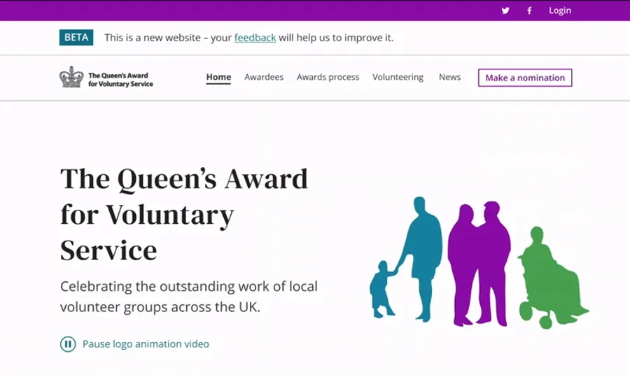
The existing QAVS logo of the crown is made up of people to celebrate diversity. We decided to create an animation of the logo for the home page hero area that spotlights the individuals that make up the crown and showcases how they all come together to form the Queen’s Awards for Enterprise crown.
New website logo animation

We wanted the site to withstand the test of time, so we kept the site design clean – using white and off-white backgrounds with lots of white space. We made it more engaging with the subtle use of colours that contrast nicely with the QAVS brand colour purple. However, ultimately, we wanted to make sure that it’s the images of the volunteers that stand out.
Our team was keen to equip the QAVS team with a site that could be regularly updated with news, information and volunteer spotlights. To ensure that all of the user needs are met, we introduced three main parts of the site:
- Awardee information and spotlights
- The awards and nomination process
- Volunteering information
You can see the transformation below:
Going live in time for the Queen’s birthday
Working closely together with the QAVS and wider DCMS teams meant that we could complete the site in just over a month from winning the tender and go live in time for the official Queen’s birthday celebrations.
We are delighted that the Queen’s Award for Voluntary Service now has a befitting website to celebrate the volunteers who do extraordinary work for local communities.
The new QAVS website plays a crucial role in championing the awardees and highlighting the essential role volunteers play in our society – now, during the COVID times, even more than ever.
The service has since been renamed the King's Awards for Voluntary Service.
Do you need help with your application?
At Bit Zesty, we specialise in building and maintaining bespoke software and integrating AI into existing applications.
Looking to build an application, but unsure of the price? Keen to discuss our experience, processes and availability?


