· · Matthew Ford · 5 min read
Making GOV.UK accessible autocomplete a suitable replacement for select enhancement
It is now mandatory for UK public service websites and applications to be fully accessible since the 23rd of September 2020.
We support a few government services such as the GOV.UK Trade Tariff and the Queen’s Awards for Enterprise. Whilst we were upgrading our web applications to meet the Web Content Accessibility Guidelines (WCAG) 2.1, we noticed that the javascript library we were using to enhance the behaviour of some select boxes was not fully accessible.
It is common to enhance the browser’s default select element with a more powerful replacement to provide type-ahead search and update the results dynamically from the backend (using AJAX). The problem is that the majority of the javascript libraries that provide this functionality are not accessible. So we set out to find a solution to making an accessible select enhancement library.
User research showed that our select replacement library was not accessible
While conducting user research with people with disabilities, we found our go-to library for select enhancement `select2` was not accessible. People using screen readers were not able to get past those fields successfully.
We discovered that other people also had similar issues with this library, but fixing these accessibility issues would require a significant rewrite of the library, which the authors nor we had time to do. Given these problems, we had to look elsewhere.
Finding an accessible select tag replacement library
We tested many popular select replacement libraries, but none of them fit our needs whilst also being accessible.
We eventually came across a library from the GDS team built for autocompletion on GOV.UK:
https://github.com/alphagov/accessible-autocomplete
What made this library compelling was that it offered a simple and accessible select tag replacement. It didn’t quite have all the functionality we required, but it met our accessibility requirements.
So we decided to improve the GDS library with additional functionality, and we are sharing the results for others to use.
What were the features missing from the accessible autocomplete?
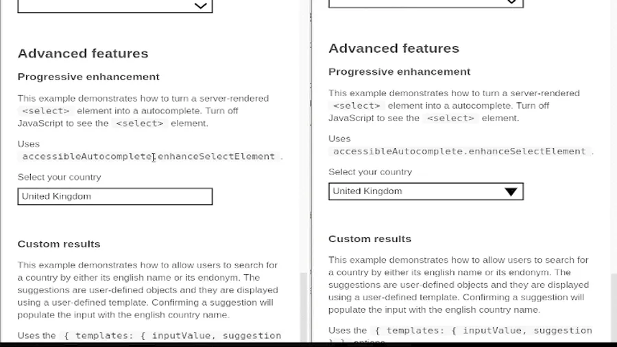
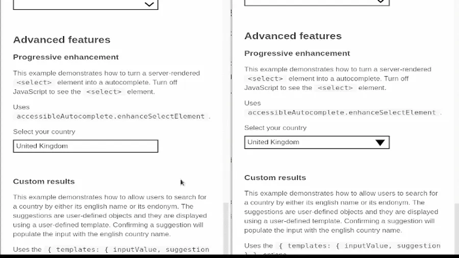
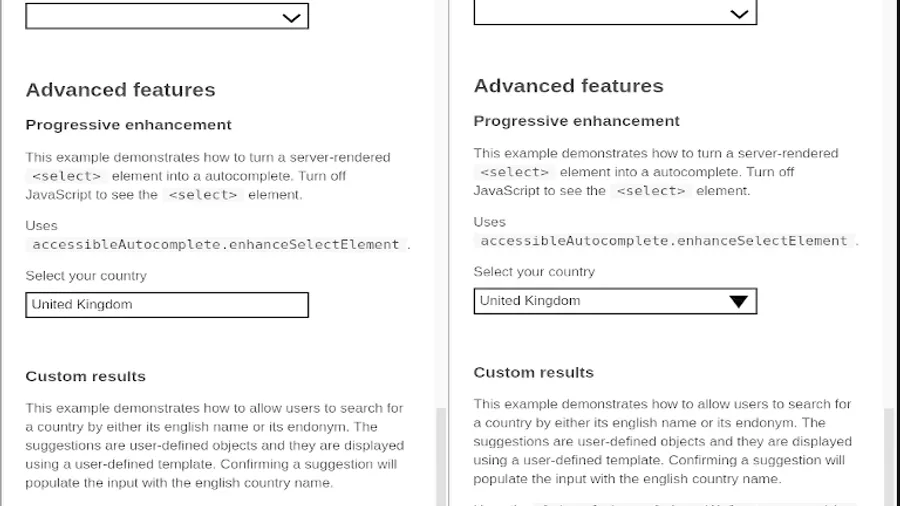
The autocomplete library was primarily created for search type-ahead autocompletion, although it can be used as a select/search replacement.
It had all the necessary groundwork to be accessible: keyboard navigation, live speech hints and updates for screen readers and proper management of ARIA roles.
The W3C established some requirements on how a select tag replacement “listboxes” should behave in terms of keyboard support. Using this guidance as well as our needs, we made the following changes:
- Ensured that all select options are visible when the dropdown is opened
- Open the dropdown when the user presses Enter key or the Space bar
- Use up/down arrows to open the dropdown and wrap around the options
- Properly manage of the focus when escaping the select component
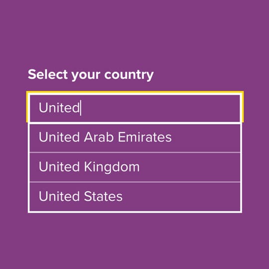
Show all options when the dropdown is opened
autocomplete library behaves like a typical search autocomplete, showing options after the user has typed a few characters then refining them as more characters are typed.
When enhancing a select, we want to keep the behaviour similar to what users expect from a select element. In this case, the behaviour we’d like to maintain is that when the user clicks on the select or opens it via keyboard, they want to see all possible options.
A further change we needed to make was handling the case where an option had previously been selected, for example, when editing a form. We needed to show the user all the options and highlight the option they had previously selected. This is not a use case of the GDS library, so we implemented it.
Opening the dropdown with Enter or Space keys
Most people use a mouse, touchpad or fingers (tap) to interact with selects, but for people who use assistive technology, keyboard interactions become their primary mechanism. Also, if you are a power user or your application is continuously used by employees, keyboard interactions help people accelerate their process, hence the importance of keeping browsers typical behaviour consistent.
This is also two of the 10 usability heuristics by Jakob Nielsen: recognition rather than recall; and flexibility and efficiency of use.
For autocomplete libraries, this is not relevant, so it is understandable for this feature to be missing. We had to add in when the select dropdown has focus but is closed, whenever the user presses the Space or the Enter key, we open the dropdown and focus on the option for the previous selection, or on the first option, if no selection was previously made.
Use up/down arrow to open the dropdown and wrap around
When the user is focusing on a closed select, if they press the up or down arrow keys, it should also open the dropdown, but with a slight difference from using the enter or space keys: when opening the dropdown using the arrow keys, the selection should be changed to the previous or next option automatically. Even if the user presses Escape, the choice should be maintained, as it happens by default in browsers.
We also worked on something subtle: the focus on the options should wrap around the bottom and top options.
Recognition is all about the expectations that people have based on what they’ve seen before.
For example, if you are on the first option and presses the Up Arrow key, then the focus should be placed on the last option, while if you are on the last option, pressing the Down Arrow key, the focus should be placed on the first option.
Proper focus management with Escape
The last change we made was the managing focus when the user presses the Escape key.
The expected behaviour is to place the focus back on the select element after closing the dropdown. For some reason, the library was focusing on the wrapper element, without any visual cues.
What we did was change the mechanism to place the focus back on the input, with visual cues to indicate the user they are actually on the closed select.
Contributing back
So far we’ve discussed what we implemented to make the GDS autocomplete library a more usable and accessible select replacement.
We will open a pull request to merge our contribution back to the GDS library. We are hoping that the GDS sees value in these changes and approves them. However, as many services rely on this library, GDS may not want to make these changes on their services just yet.
If you are interested in checking out our version it is available on Github:
https://github.com/bitzesty/accessible-autocomplete/tree/select-behaviour
Do you need help with your application?
At Bit Zesty, we specialise in building and maintaining bespoke software and integrating AI into existing applications.
Looking to build an application, but unsure of the price? Keen to discuss our experience, processes and availability?