· · Laura Paplauskaite · 6 min read
Information architecture redesign: how to make sense of hundreds of pages – Tree testing

This is the last post in a three part series on redesigning a massive information architecture. The previous post explored how you can use card sorting to begin the redesign of your IA. It is the precursor to this post.
Now that you’ve finished your card sorting and planned an information architecture redesign, it’s important to make sure it works for real users. The structure needs to serve the various user groups that interact with your website and support their user goals. So how can we check how the IA will perform and validate or improve our designs? With usability testing!
About tree tests
Tree testing is a form of usability testing that evaluates the findability of content within the information architecture. The output of a tree test reveals how easily people find information, where they look, and where they get lost. For the Barnardo’s project mentioned previously, we used Treejack by Optimal Workshop to carry out our tree tests.
Much like a standard usability test, tree testing requires a set of tasks that participants must attempt. A tree test task should test a category and label by asking the user to find content contained within it. You should write tasks to cover the key user goals for your website.
Revisit the aspects of the trees that you noted were most uncertain and write a task to test each hypothesis. For example, you might have the hypothesis that users seek information on depression by looking in the mental health section. To test this out, you can give users the task of finding information about depression on your site. Remember to include tasks that test the uncertain labels placed in multiple locations.

Users are given a task to find certain content. They navigate your tree and nominate the label where they think they’d it.
Segment the tree test by user group
Do you have multiple user groups that interact with your website? If so, remember that each user group will have a different mental model for websites, based on their experiences and user goals. To check that your IA can satisfy the requirements of all the different user groups, you should segment tree tests by your user groups. In our case, the Barnardo’s website had a number of vastly different user groups. Therefore, we created one version of the tree test per user group, with each group’s tasks being based on the goals of that user group.
Recruit users for testing
To recruit users and send them to the correct version of the tree test, we placed a screener on the Barnardo’s homepage and relevant sub-pages. The screener asked users why they were visiting the website and presented them with multiple choice response options. Users were categorised by user group and automatically redirected to the relevant version of the tree test.
We created the screener and redirect logic using a Typeform screener, which we modified with custom CSS code to better suit our needs.
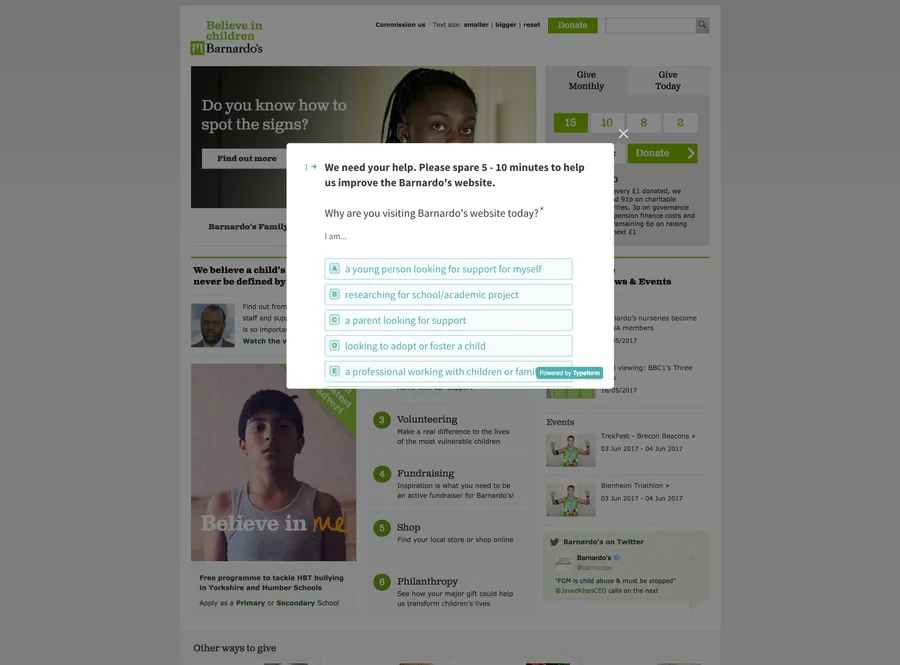
A screener recruits visitors directly from the website. The users are segmented depending on their response.
Launch the screener to recruit participants to tree test the IA output from your card sort. Keep an eye on the number of conversions from your screener and start page. We noticed that conversion rates weren’t as high as we’d initially hoped, but we improved these figures by tweaking the test introductory copy. Users were more willing to participate in the tree test after the copy shifted the focus of the research from helping us to improving the website for the user.
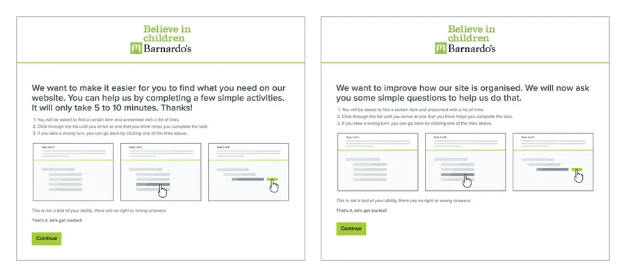
The original start page (left) wasn’t converting as well as we hoped. We improved the copy (right) and the conversion rate increased.
Carry out A/B Testing
Since we ended up with two versions of IA to test after our card sorting exercise, we wanted to perform A/B testing. Unfortunately our tools could not automatically handle simultaneous A/B testing, so we had to test one version of the new IA at a time. When enough results were collected to provide statistical significance (you need at least 50 responses per user group), the typeform screener link was switched to test the alternative version of the tree.
Once all your results are in, it’s time to start the analysis.
Analyse the results
Analyse your responses for each hypothesis tested, breaking them down by user type and repeating them for each version (A/B) of the tree. Task level metrics give an indication of how well the IA supports a particular user goal and can include: overall success/fail/skip rates, directness in selecting an answer and time taken to complete the task.
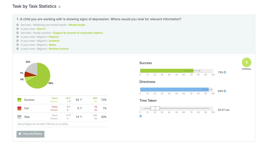
After our tests with the Barnardo’s site, task level metrics gave a quick indication of how well the IA performed for each task
For more thorough findings, you need to analyse the paths taken by users.The tool we used for the tree testing, Treejack, provided a helpful visualisation of the paths taken by all of the the users that attempted a task known as a ‘pietree’. The pietree gives an indication of how many users went down a path, the proportion of users that chose a correct path in each category, and which label the user selected as their final answer. The benefit of the pietree is that it can show exactly where users are looking (or not looking) and this information can be used to validate the IA or guide improvements.
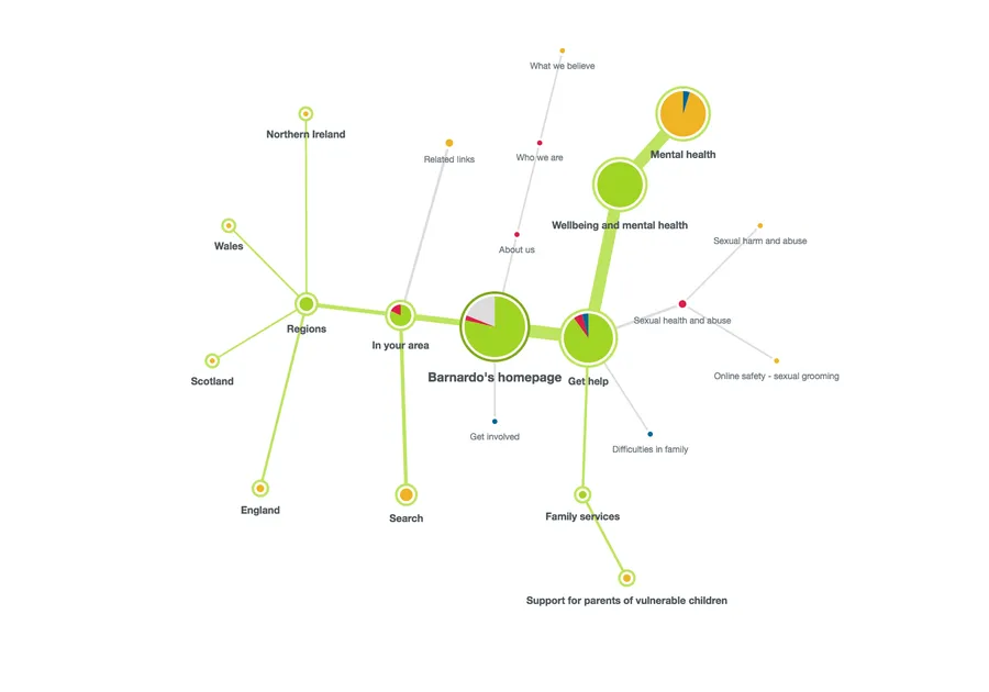
A pie tree shows the most common paths taken by users when trying to complete the task
If you are testing for multiple user groups, pay special attention to how the IA may have worked for some user groups, but not others. In our case, users found it easier to navigate Version A – the broad and shallow IA.
When analysing the results, it’s important to consider how the actual design of the website and navigation might affect how the user would perceive your IA. For example, when designing the navigation for the Barnardo’s website, we were evaluating a mega menu in which the content of the subcategories would be visible to the users. Users would be able to scan the content of a category in the mega menu, rather than viewing the label independently in the tree test.
Make improvements and continue analysis
We further improved the proposed Version A of the IA based on our findings, using parts from version B that worked better where applicable.
Be cautious when making changes to your tree, because changing one thing could break something else! For example, changing the label of a category might improve the findability of the content you were testing, but could reduce findability for other content in the category. Validate any changes you make with further rounds of tree testing.
After you’ve got your new IA up and running on your website, continuously monitor how well it’s performing with visitor analytics. Be aware that you may get initial negative results from returning users that learnt your old IA. Give your new IA some time to bed in, or only include new visitors in your analysis.
This concludes our blog series on redesigning information architecture. Check out our previous blogs for an overview of the approach to redesigning IA and how to use card sorting to kick off the process.
Do you need help creating or redesigning your information architecture? Contact Matthew, our Technical Director, today on +44 207 125 0160 or drop him a line matt@bitzesty.com for a free consultation.
Do you need help with your application?
At Bit Zesty, we specialise in building and maintaining bespoke software and integrating AI into existing applications.
Looking to build an application, but unsure of the price? Keen to discuss our experience, processes and availability?

