· · Laura Paplauskaite · 4 min read
Information architecture redesign: how to make sense of hundreds of pages – card sorting

This is the second in a three part series on redesigning a massive information architecture. In the first part we gave an overview of our process.
When faced with a massive information architecture overhaul, it’s difficult to make that first step towards a redesign. Let’s take a look at how we can use card sorting to get the ball rolling.
Collate the existing content
The first step towards creating a user friendly information architecture is figuring out what you’re dealing with. To do this, review all of the pages from the website and give them a label that represents the content. Write the label that represents each page on a separate card.
The label will most likely be the page title. If the label is too long, isn’t clear, or won’t make sense when viewed out of context, it should be re-written to something that better represents the page content. The the end result will be a stack of cards that represents the site’s content.
The cards will be used for a card sorting exercise. You might need to create more than one stack of cards if you plan to run multiple card sorts at the same time.
Choose the right type of card sort
A card sort exercise helps to define categories, group related content, and verify labels. In a card sort, participants organise the topics written on cards into groups. There are two types of card sort: open and closed.
- In an open card sort, participants organise cards into content groups that make sense to them. Then they name the groups – for example, a group could be called ‘About Us’ or ‘Products’.
- In a closed card sort, participants sort cards into predefined groups.
In our recent project working with Barnardo’s, where we had to completely overhaul their site’s IA, we opted for an open card sort. Normally it’s preferable to do a card sort with real users. However, when you have a massive amount of site content and hundreds of cards, participant fatigue is a significant consideration. Therefore, we recommend not using more than 40 cards in a card sorting exercise with a user. When redesigning the Barnardo’s IA, which had 185 labels, we considered two approaches:
1. Reduce the number of cards to include just 40 labels of key content and test with real users
Pros
- Direct user feedback
Cons
- Various different user groups needed, each requiring a different set of 40 cards
- Time constraints: card sorting with multiple user groups would take a lot of time
- A remote card sort, needed to reach the required number of users, would reduce fidelity of the findings and thus reduce the benefits of a user card sort
2. Perform the card sort ourselves with all 185 cards and test with users at a later stage to verify
Pros
- The analysis would cover the full site’s content
- The extensive research phase of the project meant that we already had good knowledge of Barnardo’s users’ needs
- Less time required
Cons
- Risk of making incorrect assumptions about users’ mental models
We decided to opt for the second option and tackle the full site content card sort ourselves. Having decided to do the card sort on behalf of users, it was important that we first revisited the outputs of the research phase of the project. This would help align our card sorting approach with user needs.
Get sorting
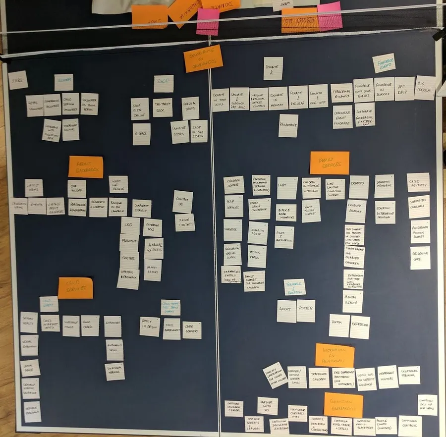
We recommend that you conduct your card sort with a few (up to five) different members of the team to get different perspectives.Three members of our team conducted card sorts independently. On completion, we reviewed each member’s suggestions.

Cards are arranged into categories in a card sort
Each of our three testers had a different approach to the IA. After discussing, we consolidated our ideas and ended up with two versions to carry forward for A/B testing.
Version A:
- Broad and shallow navigation
- No requirement for users to self-identify (user-group agnostic structure)
Version B:
- Deeper navigation
- Content groups specific to user groups
You may find that, at the end of your card sorting exercise, you have a clear overarching structure with a few uncertainties around the placement of some labels. In this case, there’s no need to take two versions of the IA forward for tree testing, but you should note any aspects of the layout that are uncertain. These will later contribute to the hypotheses for testing.
You can also duplicate the labels in question and put them in all considered locations. This allows you to evaluate what works better during the subsequent tree testing. In fact, we often found that our users looked in both locations, so we decided to leave the labels under more than one category in the final navigation.
Upload the results into tree testing software
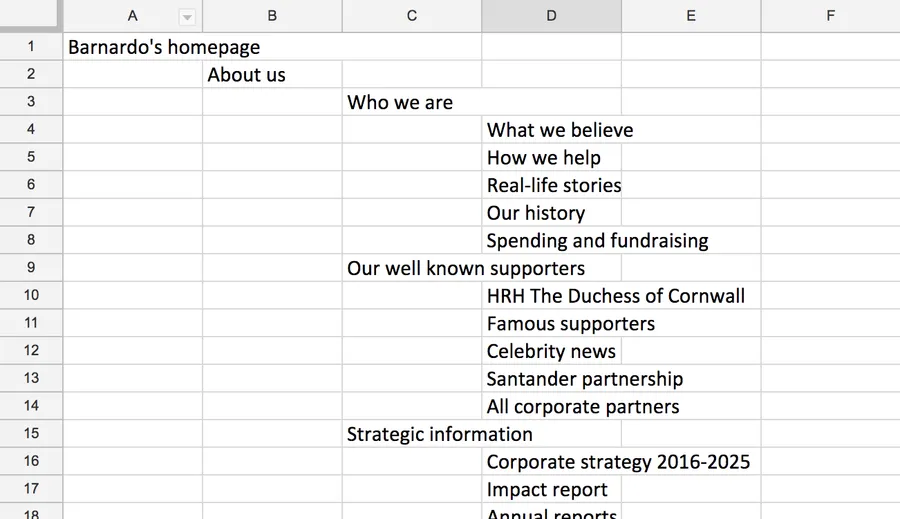
Type up the card sort output into a spreadsheet so that you can upload it into tree testing software (we used Treejack by Optimal Workshop). If you are A/B testing, you’ll need to prepare both versions. Double check that all the labels make sense in their new context. Label naming is just as important as the way the content is organised.

The card sort needs to be typed up ready to be uploaded into tree testing software
In the next and final part of this three part series, we discuss how you can use tree testing to validate and improve your proposed IA. Also, if you haven’t yet, please check out the first part in the series for an overview of the approach to redesigning IA.
Do you need help creating or redesigning your information architecture? Contact Matthew, our Technical Director, today on +44 207 125 0160 or drop him a line matt@bitzesty.com for a free consultation.
Do you need help with your application?
At Bit Zesty, we specialise in building and maintaining bespoke software and integrating AI into existing applications.
Looking to build an application, but unsure of the price? Keen to discuss our experience, processes and availability?


