· · Laura Paplauskaite · 4 min read
Web form UX: Making long and complex forms easier for users

In my previous blog posts I discussed some of the best practices for designing web forms and then expanded on form fields and labels. In this post I’m going to look at what you can do when you have to create a long or complex form to meet your organisation’s needs (and hopefully user needs), but that you know users might not like completing.
When this is the case, how can we get what we want from the form, while still making the user experience as good as possible?
Break up long forms into separate pages
Long forms put users off, but sometimes they can’t be avoided. If you have a long form with lots of questions, break it up across several web pages. This makes the form look more manageable and less overwhelming to the user.
When developing the application form for the Queen’s Award for Enterprise (Now the King's Awards for Enterprise), we divided it into a multi-step process. The form has around 50 questions, so we split it into 6 logical sections.

Let users save and come back
Although we made the Queen’s Award for Enterprise form as clear and simple to use as possible, there was no avoiding the fact that the award assessors need a lot of information from the applicants in order to select the winners of this prestigious award. It was highly unlikely that the user can complete the form in one go, so we added a ‘save’ feature.
When the forms are long or require information that the user might not have readily available, it is good practice to give users the option to save the form part way through, and come back to it later.

Provide guidance as help text
Providing help text is an important aspect for any form, especially when the subject matter is complex. Use help text to give instructions, inform users of a specific type of input that a field requires or simply provide additional guidance to give the user more context of what is being asked.
When writing help text, try to keep it as short as possible – only include the information that the user needs, but do not sacrifice clarity for brevity.
Visually, make it clear that the help text is there to support the user – it shouldn’t be distracting or slow the user down.
Many websites and web applications use ‘tooltips’, which are typically revealed by hovering over or clicking on icon with “?” for question or letter ”i” for information. At Bit Zesty we don’t like to use ‘tooltips’ to provide additional information in our forms. We believe users should be able to see all the information required to understand and successfully complete a form without having to hover or click. Also, it does not work well on the mobile devices and we feel that there is always a risk the user won’t notice the advice hidden behind a ‘tooltip’.
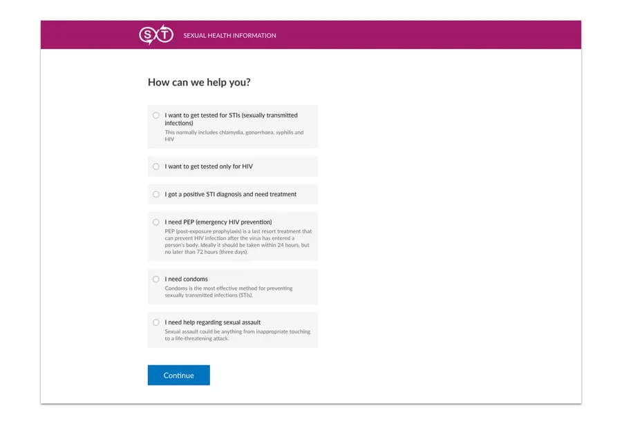
When creating forms for our client SXT, we had to ask questions about complex health topics. For the more complicated options we provided explanations as additional help text to aid the user through the form.
Prepare users for your form
Some forms require users to provide a lot of information or information that they may not have readily available. For instance, users may be asked to provide their National Insurance number or passport details to identify who they are. So prepare your users by telling them what information they need to complete the form before they start the process and let them know how long it will take. This will help reduce any frustration they may experience, saving them from having to leave the process midway through to find the required information.
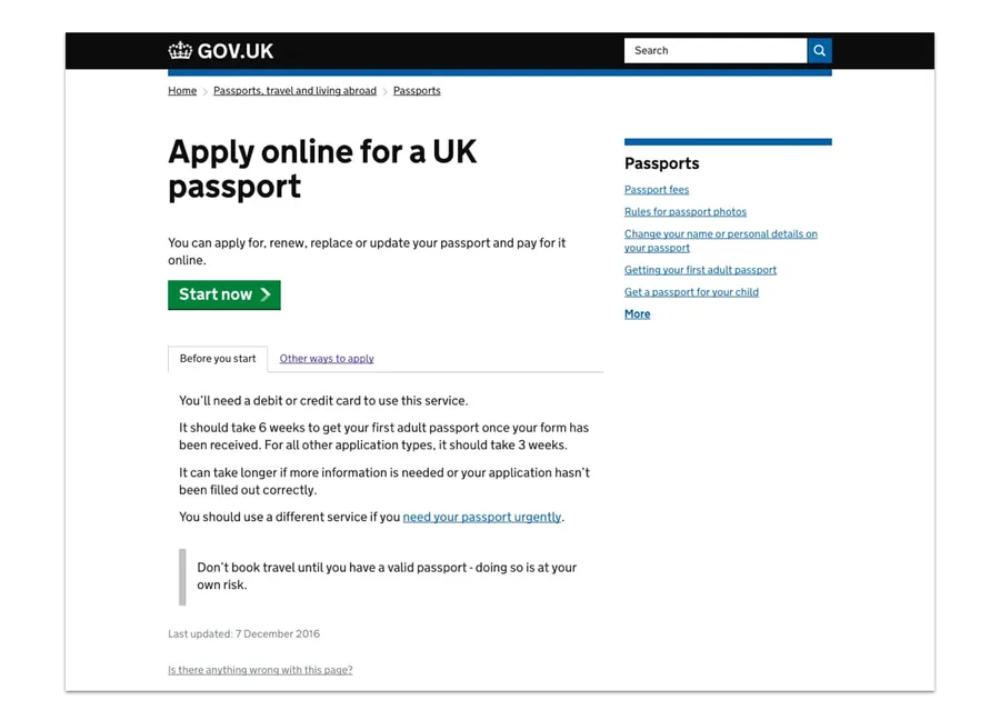
For example, before a user begins any GOV.UK application form, they are told what they will need to complete the process, along with other helpful information, such as links to similar services which may be of benefit to the user. This can be seen under the tab ‘Before you start’.
Run user testing
Always test your forms with real users. You can work on this with a UX agency, like us here at Bit Zesty, or you can run the user testing in-house.
User testing can help you make sure your forms are simple, clear and fast for users to complete. For example:
is anything on the form confusing users?
are users interpreting the questions in the way you intended?
if they don’t finish completing the form, where are they dropping off and why?
A form is often the start of a user’s journey with your organisation. They may have decided to register with you, buy from you, or donate to you. Don’t let a form with a poor user experience stand in the way.
Do you need help improving your UX? Contact Matthew, our Technical Director, today on +44 207 125 0160 or drop him a line on matt@bitzesty.com for a free consultation.
Resource list:
Jarrett, C., Gaffney, G. (2009). Forms that Work. Designing Web Forms for Usability.
Wroblewski, L. (2008). Web Form Design: Filling in the Blanks.
Allen, J., Chudley, J. (2012). Smashing UX Design. Foundations for Designing Online User Experiences. (p355-364)
Do you need help with your application?
At Bit Zesty, we specialise in building and maintaining bespoke software and integrating AI into existing applications.
Looking to build an application, but unsure of the price? Keen to discuss our experience, processes and availability?