· · Laura Paplauskaite · 3 min read
Web form UX: Best practices for designing efficient web forms

Good forms create great experiences. Today, online forms are a key touchpoint between the user and an organisation. Many of us use forms every day – registering on a website, buying something online, or completing an application form.
In this blog post I’ll discuss some best practices you should consider when designing and building an online form.
Order your form logically
Make your form more intuitive to use, by thinking carefully about the order you ask your questions. What order will seem most natural to users, and how will they expect questions to be grouped together? For instance, users are likely to expect to be asked for their name, before their address.
Just as you would when getting to know someone, start with the basic questions then ease into the more complex ones. This will increase participation and reduce the number of users who “drop-off” and don’t complete the form.
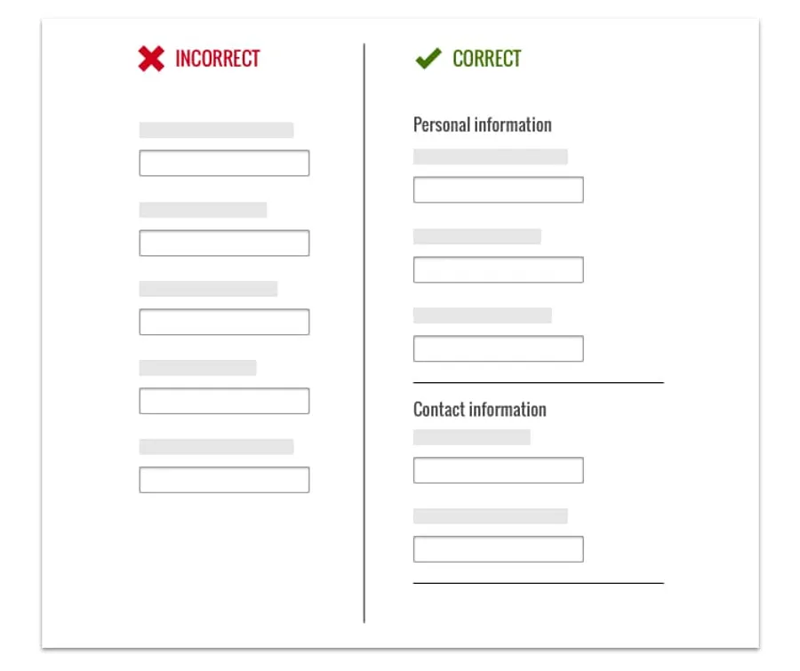
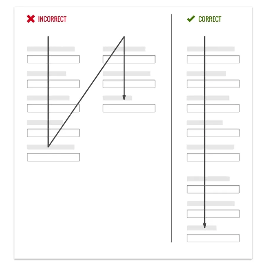
Use a single column layout
Users want to complete a web form without any hassle, and are likely to quickly work their way through the form by scanning questions. To help users, make sure the form is in a single column.
Multiple columns can cause confusion and increase the time it takes the user to interpret the information as they read in a “Z” pattern. If the form is set as a single column there is a clear and direct path to completion.
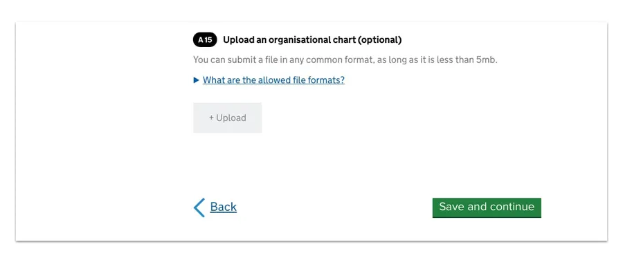
Provide clear visual clues
Think carefully about the use of colour and contrast on your form – they provide important visual clues to help users. You can see this at work in this simple form on GOV.UK.
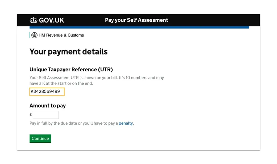
In the example above, colour and contrast are used to highlight the most important parts of the form. There’s plenty of white space on the page, and between each field. The green call to action button stands out and draws the user’s attention once they have completed all the fields.
The field size gives users a visual clue as to how much data they need to enter. The length of the Unique Taxpayer Reference field matches the length of the data required.
The field the user is currently completing is highlighted so they know where on the form they are.
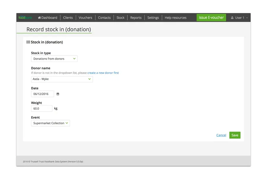
Customise the label on your Call To Action button
Users click the call to action (CTA) button to save or send their form.
It is important that your primary CTA button stands out and is clearly labeled. Generic terms like “Submit” or “Process” don’t give the user much information. Help the user by describing what will happen when they click the CTA button, for example: “Save and continue” or “Send message”.
We designed the latest Queen’s Award for Enterprise application form. The form has an autosave feature, but during user testing we discovered that many users were not sure if their progress was being saved. We changed the CTA button to say “Save and continue” to provide extra reassurance to users.
Don’t reset!
Don’t put “Reset” or “Clear” buttons on your form. This is more likely to cause a user to accidentally delete their data, than it is to solve any problems.
If your form involves sensitive data, such as a user’s financial details, you could provide a subtle “Cancel” text link. If a user decides not to finish completing the form, they can click cancel and leave the form confident that their data has been deleted. Make sure the cancel link is less prominent than other buttons on the form, to reduce the chance of accidental clicks.
For example, in a form we designed and built for the Trussell Trust, there’s a clear differentiation between the ‘Save’ and ‘Cancel’ call to actions in the bottom right hand side of the screen.
In my next post, I’ll be taking a in-depth look at how to construct appropriate form fields and create meaningful labels for your web forms.
Do you need help improving your UX? Contact Matthew, our Technical Director, today on +44 207 125 0160 or drop him a line on matt@bitzesty.com for a free consultation.
Do you need help with your application?
At Bit Zesty, we specialise in building and maintaining bespoke software and integrating AI into existing applications.
Looking to build an application, but unsure of the price? Keen to discuss our experience, processes and availability?