· · Laura Paplauskaite · 6 min read
How User Testing Became the Driving Force of the QAE Project

The rebuild of the web app for the Queen’s Awards for Enterprise has seen a number of iterations, and across those iterations the application has changed in its design, layout and content.
Our research team for the QAE project remained consistently active from the initial three week discovery phase (about which you can read in more detail
here), all the way through until the end of the beta launch. Their user testing – even later on in the project – was the driving force behind all of our decisions.
The methodologies behind our user testing
Before going into the details of the analysis, I would like to set the scene by explaining the objectives and set-up we had.
Research questions
The studies were positioned to collect data to answer several research questions, including:
- Task completion – How easy is it for applicants to accomplish key goals and tasks?
- Navigation and information architecture – How does the site structure support applicants’ ability to accomplish their tasks? Can they navigate to where they want to go and accomplish their tasks quickly and efficiently?
- Content and terminology – Do the applicants understand the information provided and the questions?
- Communication and site impressions – What are applicants’ overall impressions of the site?
Equipment and software
We used a Windows machine, running the QAE application in either Firefox or Chrome depending on user preferences. Morae was used to record from screen, webcam and microphone.
Staff
Two members of the research team were present throughout the tests – one to lead the session and interact with the subject, and one to observe and make notes.
Users
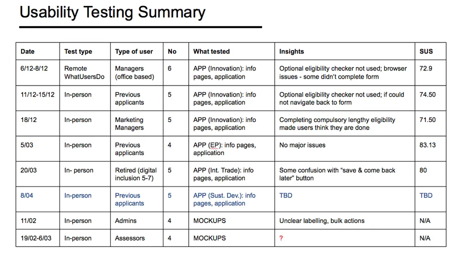
Below is a summary of the testing sessions held which highlights the number and different type of users we tested with:
Testing and analyses approach
Due to the highly content-driven nature of the application, our content designer often sat in on the user testing sessions to get first-hand feedback from users. However, for the rest of the project team – at Bit Zesty and Queen’s Awards Office, we held debrief sessions where design solutions were discussed by everyone and decisions were reached jointly.
We also prepared a usability study report detailing findings, recommendations and any other valuable information so that all members of the team would have access to the same findings as and when they needed them – for clarification, for new iterations of the software, or simply to keep up with the project’s development.
Eligibility criteria: iteration on the evidence of user testing
As we were using agile methodologies, the service was developed in iterations over the course of the project. With regular user testing throughout both alpha and beta phases, we were able to drive these iterations with the findings from our studies.
One particularly prominent issue raised by the QAE discovery phase was that of the eligibility criteria for the various Queen’s Awards. A large number of applicants were beginning applications – and even submitting them – without being sure of the eligibility requirements, let alone whether or not their organisation could apply. This part of the service was clearly in need of a redesign.
Based on the initial findings of the discovery phase, our UX team’s first move was to turn the static list of eligibility criteria into a simple eligibility questionnaire, providing users with a way of receiving definite feedback on their organisation’s eligibility. There was the ‘general eligibility’ – prerequisites to apply for any of the awards – and then the specific eligibility criteria for each award. Our service flow (shown below) also provided the option of a all-award eligibility checker – so users who were unsure which award to apply for could check for themselves.

The first round of in-person user testing picked out the problem with this flow: users almost always bypassed the all-award eligibility checker, with four out of our five users choosing the more direct route into the form. To account for this, in the next iteration of the application we made it compulsory, and placed it alongside the basic eligibility check:

This threw up an entirely different problem, with lots of our second round user-testers believing they had completed the full application form when really all they’d done was get through the new, supposedly improved, longer eligibility check.
To solve this, we first addressed the flow – by moving the eligibility questionnaire to after the account details page:

And then fixed the content – by improving the signposting all the way through this part of the service with intermediary pages such as this one:
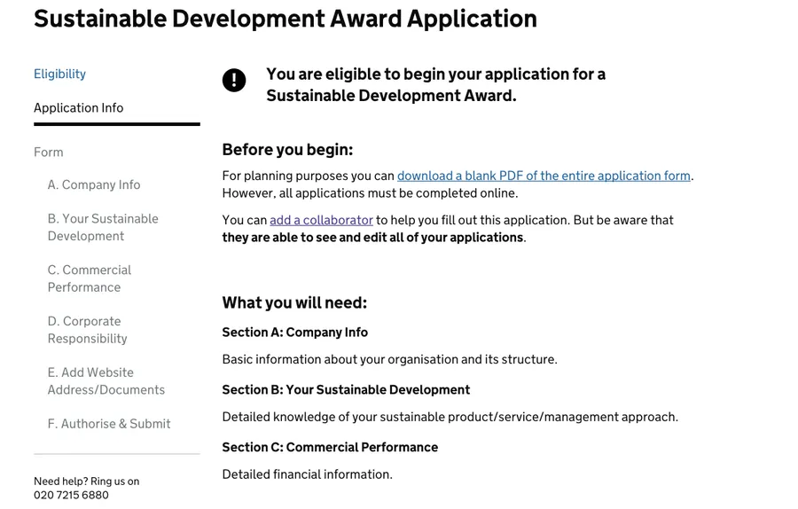
In our subsequent rounds of user testing – even those with users between 5 and 7 on the digital inclusion scale – the eligibility checks were completed without issue. The last round of users gave the system an average SUS (system usability score) of above 80, a result which puts the QAE web application in the top 10% when it comes to usability.
Improving details: saving the user’s progress
Saving of progress is, unsurprisingly, something that the majority of users filling out a large web form worry about. We learnt this early in our discovery phase, and we learnt it again throughout our user testing.
For this reason it was a no-brainer to include an automatic saving function in the application form. But it was the signposting of this fact – making sure users knew their data was being saved – which required testing to get right.
Users of web forms aren’t used to their answers saving automatically, so during the first round of usability studies – although we had signposted the feature in application guidance notes – a few voiced their concerns over whether their progress was being saved.
In order to solve this issue we decided to cater to their expectations – by changing the button at the bottom of each form page from just “save” to “save and continue”.
Although we save their work more regularly than this, the positive feedback reassured the users in the subsequent usability study. However, it also created uncertainty for users who wanted to exit the form – if they could ‘save and continue’, why couldn’t they ‘save and exit’?
In response to this new issue we trialled the ‘Save and come back later’ button shown below, but three out of five users in the subsequent testing session accidentally clicked it instead of ‘Save and continue’, leaving the form when they expected to be taken to the next page.

This was our final solution:

A footer giving users posting feedback regarding saving, whether they wish to continue or exit – a small detail, perhaps, but one essential to reassuring users throughout their use of the service.
Improving details: navigating the application form
As we were creating a long multi-page web form, the in-form navigation menu was something we put a lot of time into throughout the project. Our initial iteration of the menu, taking into account GDS guidelines, was placed at the top of the form page, like this:
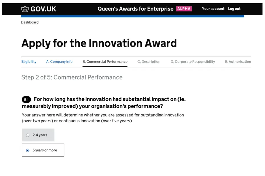
However, during our user testing we began to see that users weren’t familiar with this layout – with one asking why she couldn’t see her progress on the left hand side, one commenting that the blank space on the left could be used better, and multiple users not even seeing the top navigation. Moving it to the left of the page was the only sensible solution.
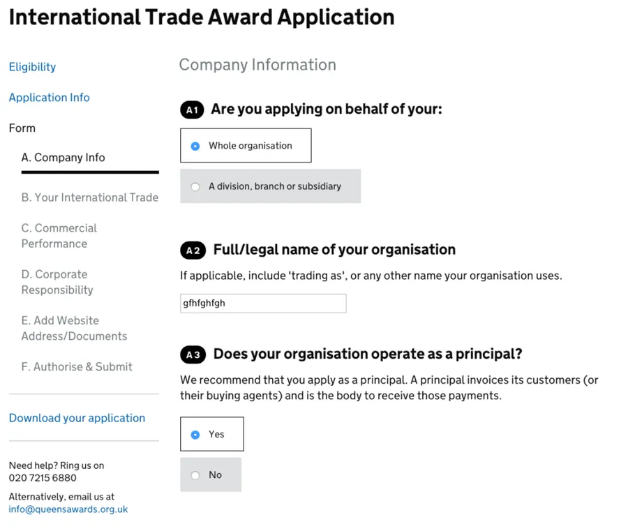
As you can see, this iteration provided us with more space for information in the navigation menu, and also tested flawlessly in the next usability study.
Conclusion
This iterative progression towards a better service was probably the defining feature of the Queen’s Awards for Enterprise project – with user testing having huge impact on the application’s content and service design in particular.
By ensuring that the UX team stayed closely linked with both the QAE stakeholders and the rest of the project team working on the application, we were able to act on user testing recommendations swiftly, making efficient use of every testing session to ensure we produced a service based on evidence gathered directly from our users, and catering to their needs.
You can read more about this project in the posts below:
The Queen’s Awards for Enterprise Discovery Phase: Starting with Users
QAE: Content Design Within the Context of User Experience
The Queen’s Awards for Enterprise: Passing Digital by Default Service Assessments
Do you need help creating or improving a digital service? Contact Matthew, our Technical Director, today on +44 207 125 0160 or drop him a line on matt@bitzesty.com for a free consultation.
Do you need help with your application?
At Bit Zesty, we specialise in building and maintaining bespoke software and integrating AI into existing applications.
Looking to build an application, but unsure of the price? Keen to discuss our experience, processes and availability?
