Perhaps the most unique feature of GOV.UK is the single-mindedness with which it puts content first. And when you’re making a new service – as we have been with the new Queen’s Awards for Enterprise application – it’s important that your content will sit alongside the rest – matching it not only in style and tone, but in quality also.
It takes a great deal of planning, preparation and testing to make sure your content is up to this standard – that it’s meeting user needs in a concise and relevant fashion. For the Queen’s Awards for Enterprise, our UX and design teams were heavily involved in the process of content design from the very earliest stages, and in return our content designers spent time with the UX team collecting first hand evidence to apply to the service.
Discovery: gathering requirements, knowing your users, understanding the service
The Queen’s Awards for Enterprise project began with a three week discovery phase (about which you can read in more detail here) where the user research team gathered data and feedback on the original system from a variety of sources, using a variety of methods. These included interviews with public users and QAE assessors, analyses of existing data, and requirements gathering workshops with the QAE administrative team.
Our content team used this evidence to inform a lot of their design decisions, aiming to improve clarity and understand how users approached each question (i.e. how the QAE team expected applicants to answer a question, and what information/guidance the applicants would need to respond).
The discovery phase was also a good way to get familiar with the service and its users – to learn more about its history, the types of people who apply, how they view applying, how they approach the process etc. For content designers who need to select a tone of voice and style of writing for the entire application, it’s extremely important to gain a deeper understanding of – and empathy with – the users they are writing for.
“For content designers who need to select a tone of voice and style of writing for the entire application, it’s extremely important to gain a deeper understanding of – and empathy with – the users they are writing for.”
Creating the application form
The most prominent feature of the Queen’s Awards service is the application form itself. This form needed to be tailored to the needs of the different users who apply to each of the four Awards categories: International Trade, Innovation and Sustainable Development, and Enterprise Promotion. Each of these categories has its specific form, with a unique set of questions.
In the original application process, each category form consisted of a PDF with questions and a separate PDF for guidance notes. One of the main aims of the rebuild was to take this information spread out across multiple documents and web pages on the old system, and bring them together in a more ordered, logical manner. This would improve the experience of the service on the whole.
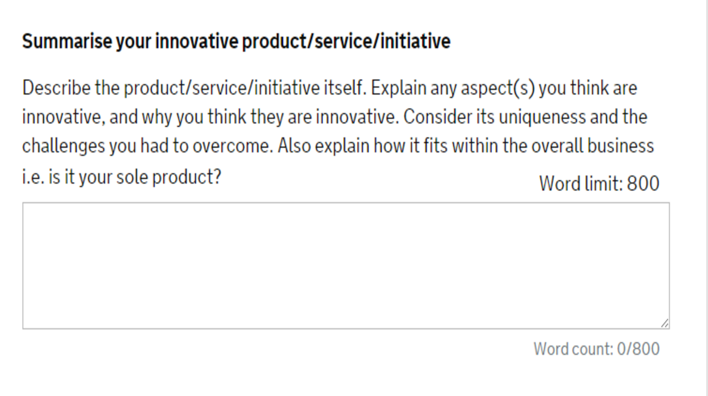
We began with the simple process of transcribing the PDF applications into a format which the content team would be able to work on – ie. a spreadsheet – and then started to adjust them in terms of content and structure. Moving the help-text for each question inline with the questions was first priority, often requiring significant changes in copy to fit their new context below the question itself:
We also improved the clarity of lots of question copy, based on the problem areas highlighted in the Discovery phase, before moving on to one of the most common adjustments we made to the format of the application form: the inclusion of regular qualifying questions throughout.
“Sometimes you have to create more content to show the user less.”
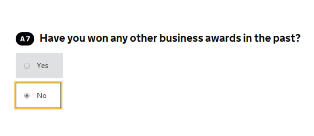
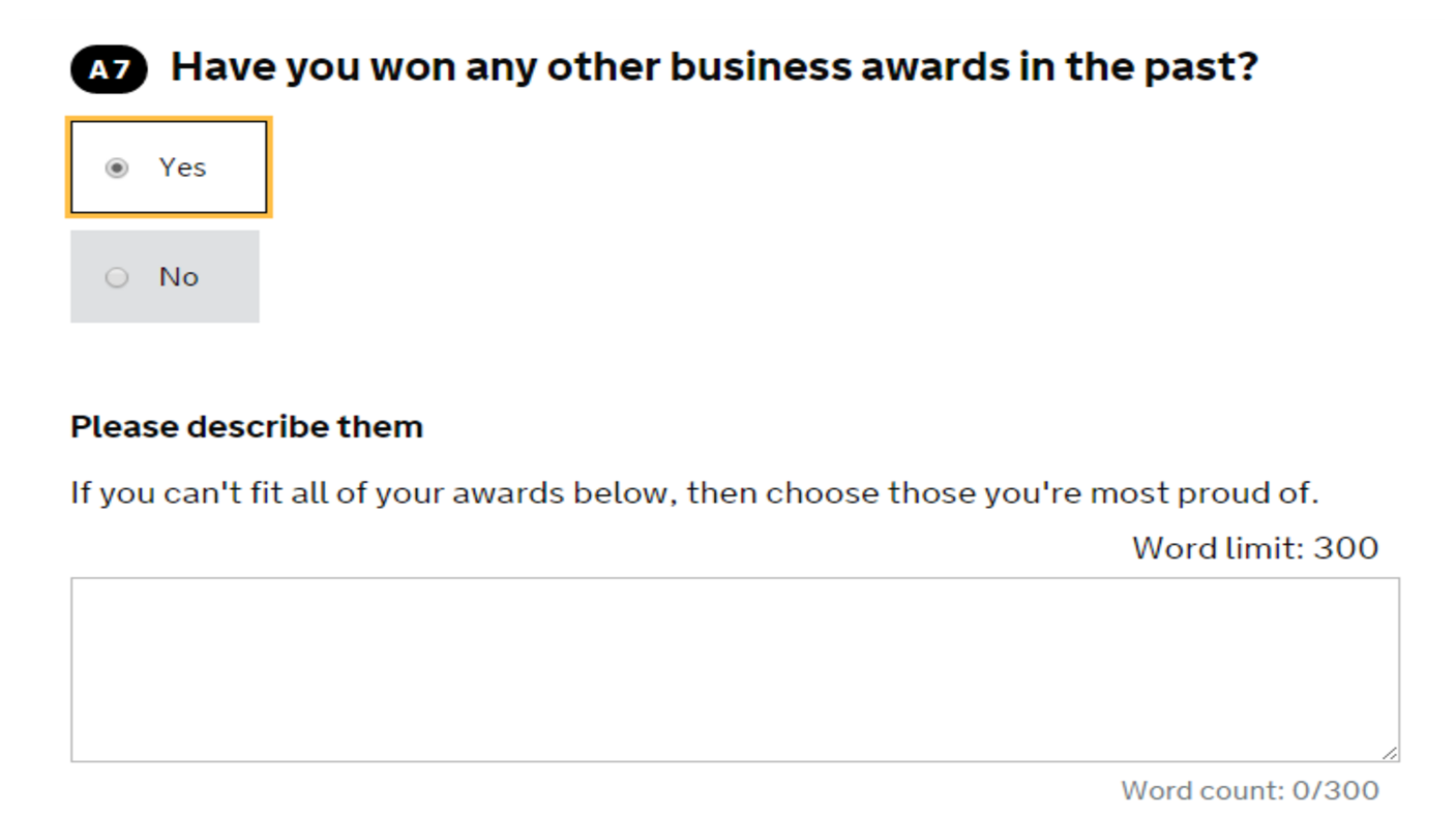
A qualifying question is an initial question whose answer decides which subsequent questions the applicant sees, and although this meant increasing the overall number of questions, these qualifiers reduced unwanted information for many users, improving their experience of the service as a whole.
In this example, only users replying ‘Yes’ will see a new field asking them for further information.
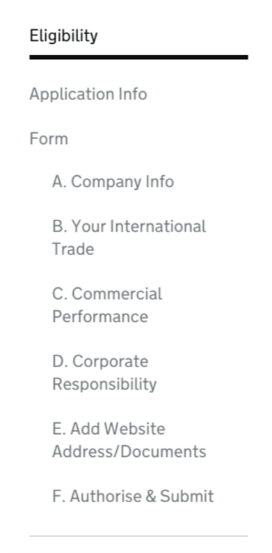
The structure of the form was also something which the content design team improved. Both in terms of question ordering – which was adjusted to make sure questions were placed in the relevant context alongside similar questions – and grouping into subsections:
These subsections not only provide a sense of the progress being made as you move from page to page, but they make it easy for contributing team member to find relevant section (eg. someone from finance for section C) to fill out certain questions.
By the time we’d finished with the forms, we’d ironed out many of the issues raised with the previous version of the Queen’s Awards application, and also made it considerably easier to complete the form for small businesses, huge enterprises and marketing companies alike.
Content design and user experience testing
“How is your content received within the context of the larger digital experience?”
As the Queen’s Awards for Enterprise service is exceptionally content-oriented, the user experience and content teams worked closely together for the duration of the project. To make this process even more robust, this included a content designer sitting in on user testing sessions to gather first-hand feedback. Testing like this, the content team were able to assess how the content was received within the context of the larger digital experience.
Over the course of the project we held six rounds of testing sessions with applicant users – at least one for each of the Queen’s Awards categories – meaning we could validate the changes we made to the application forms.
Inviting past applicants of the Awards to participate in the usability testing sessions was very valuable for the content design team because it not only provided an opportunity to gather useful feedback from regular applicants but it also helped to develop a good understanding of the Queen’s Awards for Enterprise core user group.
Microcopy and signposting as part of the user flow
Another one of the key areas over which the content and UX teams collaborated was perfecting the user flows, using intermediary pages to signpost where a user was in the process of applying.
For example, in the new version of the service we decided to implement an eligibility questionnaire instead of the former static list of eligibility criteria – an essential improvement because in the past many users had started applications to the awards being unsure whether they were eligible.
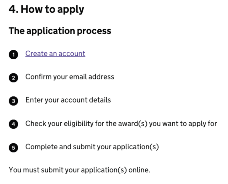
However, in our initial user testing we found that this change meant some users confused the eligibility questionnaire with the application itself. To remedy this, the content team went about outlining the process, then creating a series of signposts throughout the service in order to establish, and then reinforce, the steps each user would need to take to use the service successfully.
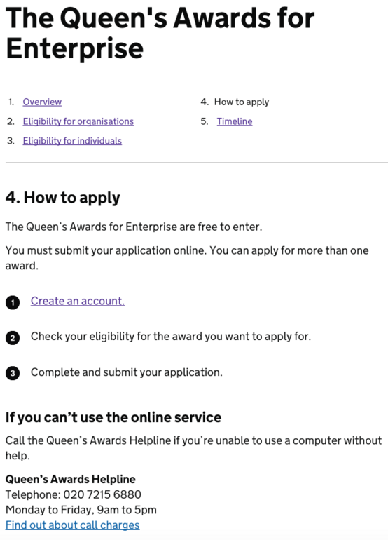
This is first explained on the ‘How to apply’ page:
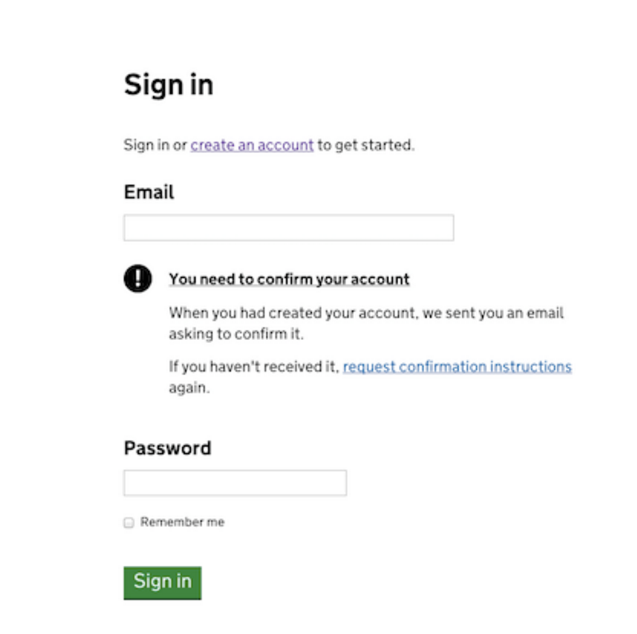
Followed by a series of signposts that notify the users of their position in the service, from button microcopy to small messages like the ‘you need to confirm your account’ in Sign in page if user has done that yet:
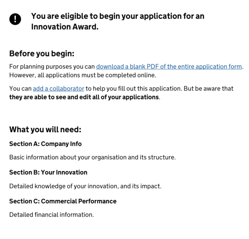
To the large, information rich intermediary page between the eligibility questionnaire and application form:
Once these changes had been implemented, the flow tested considerably better than any of the others previously tried by the UX team, with a System Usability Scale score of over 80 – a score associated with very good task completion.
How we designed our direct communications with users
One of the most exciting elements of the new Queen’s Awards for Enterprise service is just how much of an interactive experience it is: user actions at almost every stage of the process influence what is and isn’t shown; certain information is only provided to those who need it.
However, this approach to creating a service requires plenty of direct communication with the user in the form of error messages, notifications, emails and the questions of the application form itself. And these messages, which are the dialogue between users and application, have probably the greatest impact on an applicant’s relationship with the service.
These messages are designed to establish a level of trust in the service. They’re designed to be authoritative and informative without being condescending.
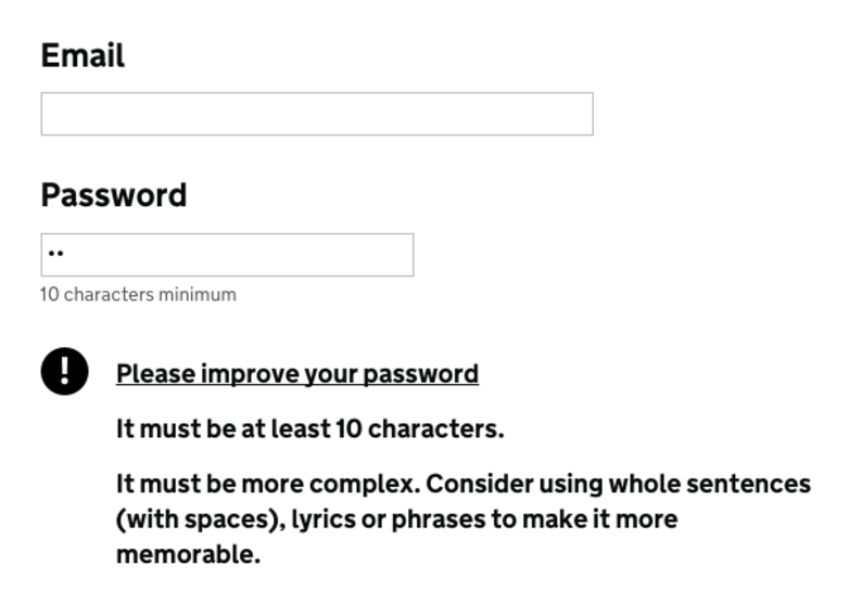
For example, even the password strength reminder was written considering overall tone of voice and user experience. On the one hand, making it abundantly clear the user will not be able to move forward without improving their password, but also providing them a viable solution to that problem:
“Direct messages – errors, emails notifications – should establish a level of trust in the service.”
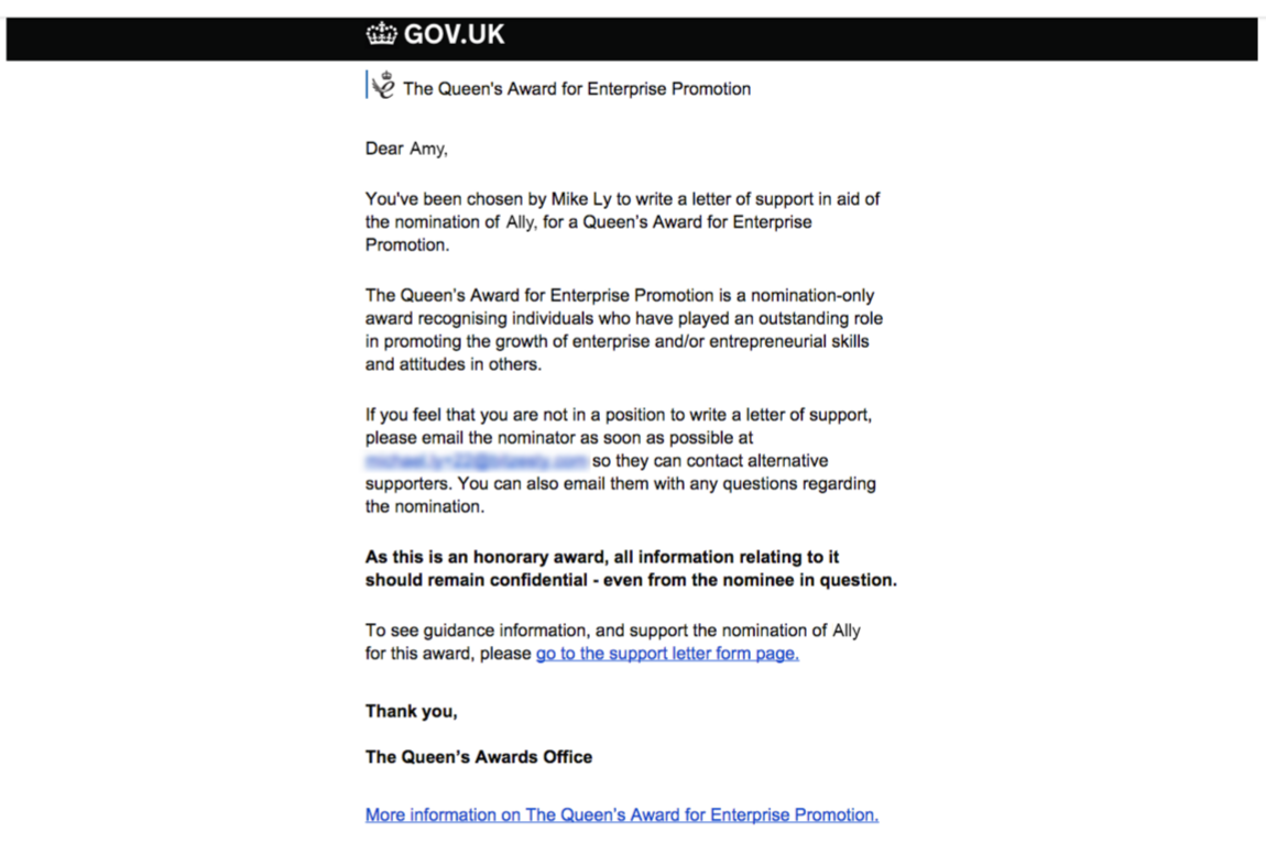
We also wrote the email communication for all stages of the awards, transitioning from the HTML emails used in the previous version of the Queen’s Awards application to all-text emails. This not only solved most mail client compatibility issues, but also meant far more of an emphasis on the content:
With email communications in particular, you have to strike a balance between including niceties that make the email feel human and pleasant to read, without bloating the message with language that’s unnecessary, or getting overly chatty.
Keeping in line with the GDS style guide
When you’re creating an application to become a part of the GOV.UK platform, you benefit from GDS’ large, well-researched selection of guidelines: the Digital By Default Service Standard helped inform our operations, the Design Patterns provided us with the essential pages for informing the public of what the service does and how they use it, whilst GDS’ Writing for GOV.UK guide provided the content team with a foundation upon which to base their work.
Although stylistically following the GDS writing guidelines by using short words, simple sentences etc. was relatively natural for the content team, one of the most important tasks we had to manage was selecting the information that would go into these pages – and the format it would take – to ensure users had everything they needed to begin using the Queen’s Awards service.
This was done to reflect how users read on the web, with easy-to-understand menus signposting users to the right area of the service. We also gave priority to essential information – such as eligibility criteria, deadline dates, and the various types of awards – with lots of clear subheadings and bullet points:
A new way to approach content: service design and the user experience
When you’re creating an application as heavily content oriented as the Queen’s Awards for Enterprise project, it’s inevitable that the overall user experience of the service becomes directly entwined with the quality and relevance of the content. Users need to be signposted by concise microcopy, informed by long-form content, and ushered through the service with useful, relevant instructions.
This was possible for us because – rather than designing content and experience separately – we integrated the processes, meaning all team members had a greater understanding of the others’ role in the project, with user experience architects and content designers working together on everything from content and microcopy to interfaces and user flows.
As we were a relatively small agile team, we were able to repeat this process through the iterations, user testing and through all the subsequent improvements to the application, making sure content stayed at the heart of the user experience – and the service as a whole.
You can read more about this project in the posts below:
The Queen’s Awards for Enterprise Discovery Phase: Starting with Users
How User Testing Became the Driving Force of the QAE Project
The Queen’s Awards for Enterprise: Passing Digital by Default Service Assessments
