Part one of a three part series on UX design for the medical sector.
Tech companies operating in the medical sector today have fantastic opportunities for innovation. In an industry where saving time, communicating clearly and sharing data can save lives, technology can help healthcare services become more effective. UX plays a critical role in this. However, while most standard UX principles apply, there are some special considerations needed when it comes to healthcare. This series of three blogs will explore how we can optimise UX for the medical sector.
MAKE IT QUICK TO USE
Minimising time spent on a task is arguably the most useful metric for measuring UX success when it comes to healthcare professionals. Other common UX metrics, such as maximising time spent and improving user return rates, are not usually relevant here.
Healthcare professionals are stretched for time, so keep things to the point and help your users stay on task. Consider GP consultations, for example. Consultation times are short, with very little time between patients. If a digital health tool were to be used to assist GP consultations, it would have to be very quick to use. It’s crucial that medtech does not add time by creating more work.
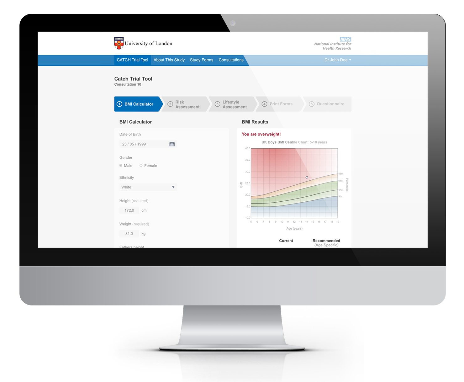
For example, we worked with London School of Hygiene & Tropical Medicine (LSHTM) to help GPs tackle childhood obesity more effectively. The key challenge was to diagnose obesity in children in the limited time available during a consultation. The digital service we created, called CATCH, guides health practitioners through a series of questions to ask their patient and produces reports that patients can take away. This crucially speeds up the diagnosis and reduces the time required for consultations.

The CATCH tool helps GPs tackle childhood obesity more effectively. Health practitioners described it as easy to use, and most importantly, a time saver.
IMPROVE PROCESSES
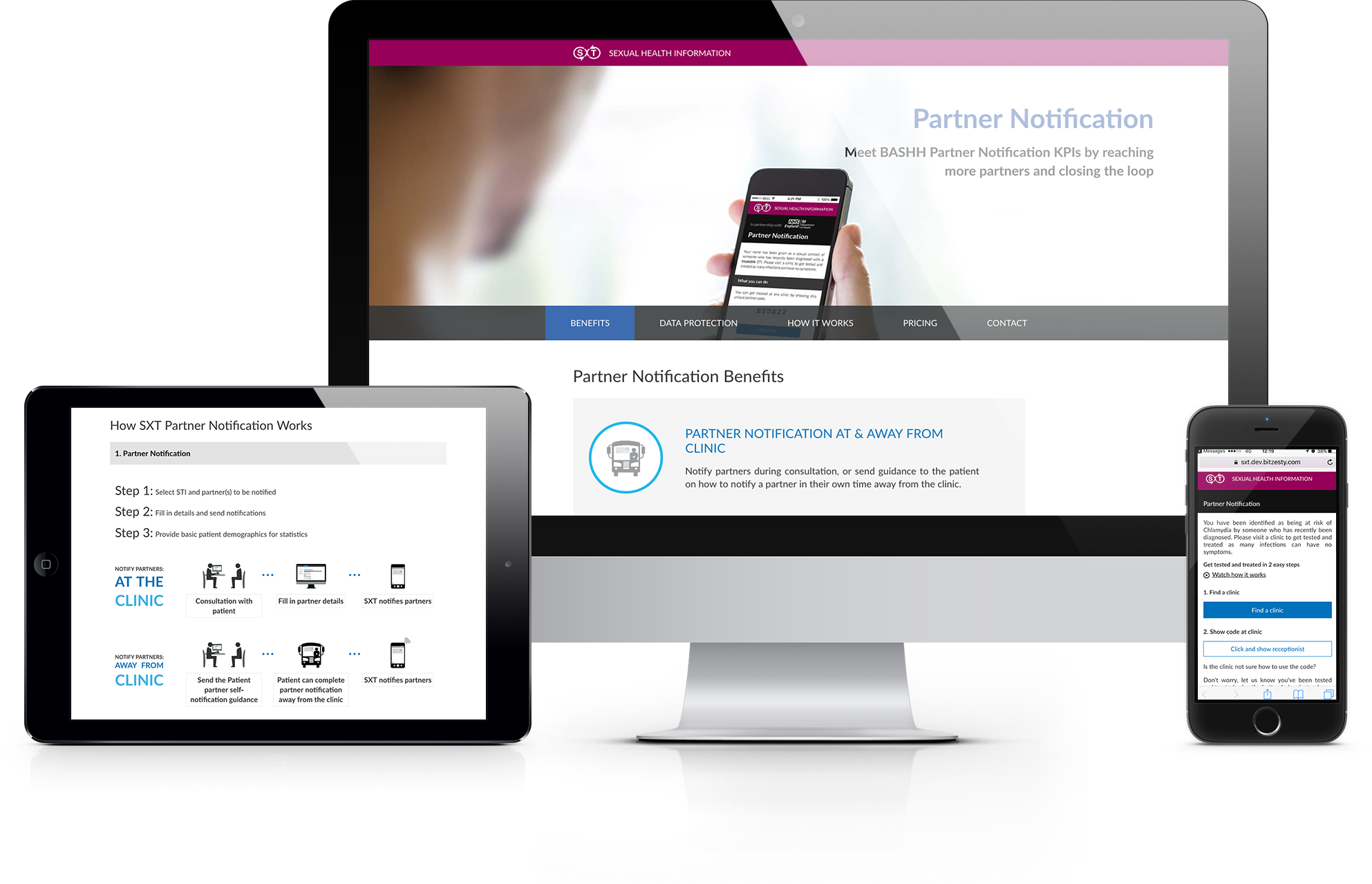
Streamlining the UX for patients can improve patient engagement and help them find a better outcome. For example, we created a tool that allows patients, or their healthcare clinic, to notify sexual partners about an STI risk. SMS or email messages are sent to partners, informing them that they need to be tested and helping them find their nearest clinic. We successfully re-imagined the whole partner notification process in order to improve efficiency and engagement. By optimising the user journey, we have ultimately reduced the spread of STI infections.
MAKE IT CONFIDENTIAL & ANONYMOUS
Another way to increase user engagement is to make patient anonymity and confidentiality a top design priority. Health issues can be very sensitive, and disclosing details around them can make people feel uncomfortable. For this reason, it’s best only to collect and store essential information. Also, to help build trust and confidence, where applicable, reassure users that the information they provide is kept in strict confidence. If sensitive information is required, allow the user to find out why this information is needed in case they want reassurance.
When designing the SXT partner notification application, we made patient anonymity and confidentiality our priority. Key to the application’s success was that it enabled patients to inform their partners anonymously, and did not store any personally identifiable information. This not only reduced the data compliance risks, but also increased patient engagement.

The SXT partner notification system was developed by Bit Zesty to allow patients or clinics to anonymously notify partners of an STI risk.
MAKE SURE IT IS INTUITIVE
It goes without saying that all websites and digital tools should be intuitive to use, and this is especially true in healthcare. Patients might only use a healthcare app when they’re not in good health, and the time gap between uses might be significant.
Don’t assume that following the design of popular apps will create an intuitive experience. For example, even if Instagram is your target user’s favourite app, don’t be tempted to copy its icon-only navigation. Instagram users return multiple times a day, which cements their knowledge of the app’s layout.
No matter how slick it looks, if your app takes time to understand, the patient will get frustrated and, if other options are available, they might give up.
Keep all these points in mind when designing for the healthcare sector. But don’t forget, there’s no substitute for user testing when it comes to validating your ideas and designs.
This is the first of our three part series on UX design for the medical sector. Check out the second part on the visual interface and third part on the importance of language.
Do you need help creating or improving a healthcare app? Contact Matthew, our Technical Director, today on +44 207 125 0160 or drop him a line [email protected] for a free consultation.


