In my last blog post I looked at web form design and layout best practices to improve usability. In this post I’m going to look at what you should consider when adding fields and labels to your web form.
Offer friendly inline validation
Traditionally, form validation happened after the form had been submitted. The user was then presented with a list of problems they had to scroll back through the form to find and fix. An annoying and time consuming process for the user.
A far better approach is to dynamically display validation inline as a user is completing the form. This means that as soon as a user enters incorrect data, a clear validation message appears next to the field. The user can then fix the issue straight away.
Dynamic validation can also be used to provide reassurance by letting the user know when they’ve completed a field correctly.
Twitter’s sign up form uses dynamic inline validation to let the user know whether a field has been completed correctly or needs to be changed.
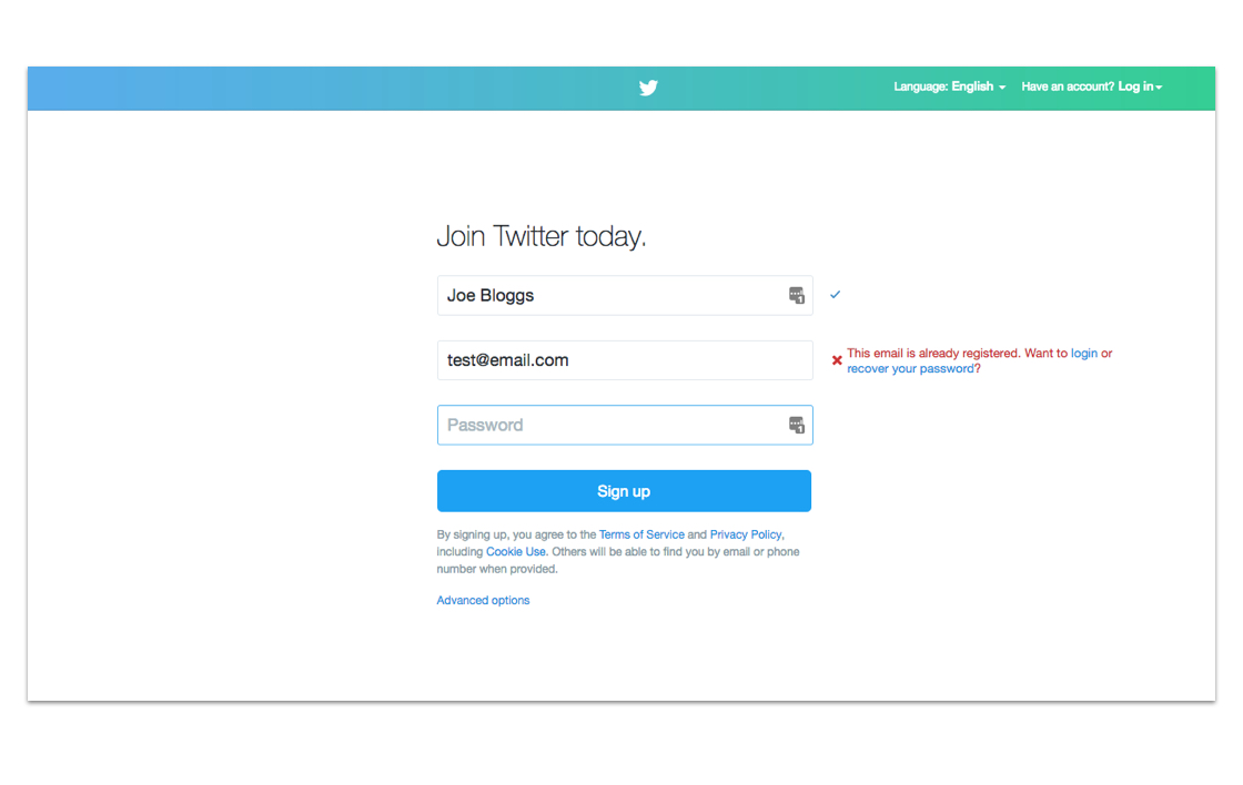
Make sure your validation messages are polite, clear and, most importantly, useful! Messages like “Error” or “There’s a problem with this field, please check again” are of little help to the user and sound a bit rude. Keep your validation messages friendly, explain what’s wrong and, where possible, suggest alternatives the user could try.
Save users’ time by doing some of the work for them
Where possible, add default information to fields to save the user time. For example, you can prefill the country field by determining the user’s location from their IP address, or you can prefill a user’s address using data from their account details.
You should be mindful however that users may overlook pre-filled fields or may decide to save time and just go with the pre-filled information even if it’s wrong. This may lead to a bad user experience or bad data.
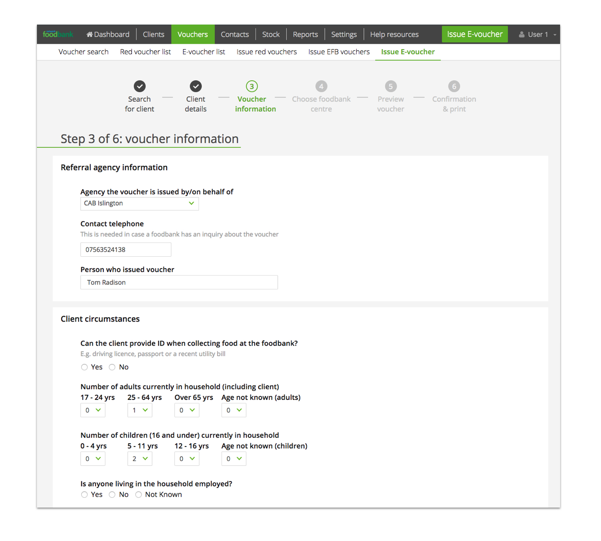
For our client Trussell Trust, we pre-populated fields with information from previous entries and user login details, to help improve the process of issuing a voucher to a client.
Reduce the number of fields
Organisations often want to get as much data about their users as possible. This is understandable, but needs to be balanced against the fact that people don’t like completing long forms and often object to giving “unnecessary” information.
The shorter you can make your form, the more likely users are to get to the submit button.
If you need to trim down a form, a good place to start is by getting rid of any optional fields. If a field isn’t mandatory, do you really need it on your form?
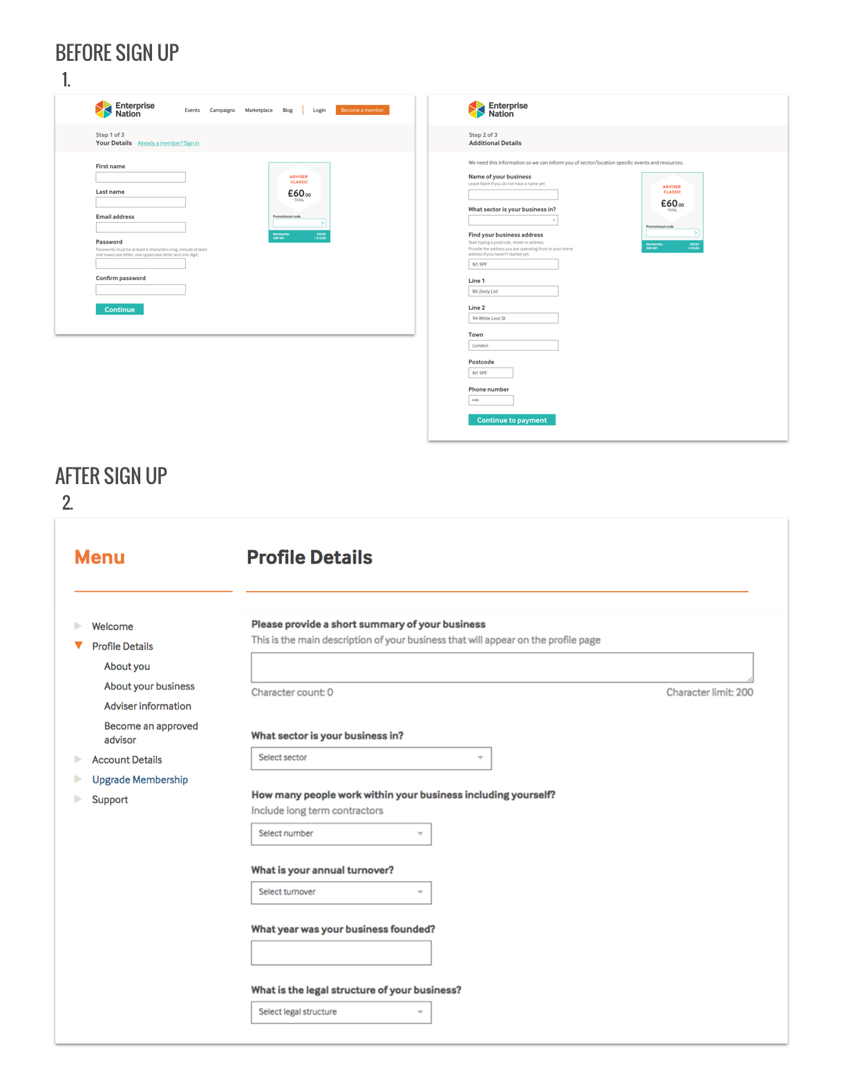
In his book, Luke Wroblewski (2008, p57) suggests you “consider asking optional questions only after a form is completed. Chances are you’ll get more answers than if these questions were part of the initial form.” We’ve put this into practice with forms on our clients’ sites, and have found it works well, particularly with checkout or registration forms. For instance, with our client Enterprise Nation we kept the number of fields to a minimum during the registration process and provide additional fields once a user has signed up and became a member.
Mark the optional fields, rather than the mandatory ones
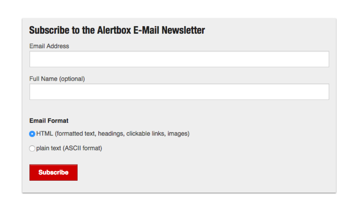
It’s common to use an asterisk to show when content is mandatory, however during user testing we’ve found that some users, particularly more mature users, don’t know what this means. Also, if most questions on your form are mandatory, the asterisks can create a lot of “visual noise”. For these reasons we recommend you don’t use asterisks, but instead clearly state next to a label if the field is optional, as in this example on the Nielsen Norman website:
Use meaningful labels and put them above the field
Field labels are an important part of form design. They tell users what information they need to provide, in what format, and whether the information is mandatory. Concise, descriptive labels help the user to complete the form more quickly and create a better user experience.
Take time to think about how a user will interpret what they’re being asked. If necessary, don’t be afraid to provide additional content to provide help, explain a key term, or show an example of what’s required.
Position your labels above the field, rather than on the left, as this has been proven to reduce the time it takes users to scan the form. Putting labels above the field, also gives you greater flexibility, as this layout works well with a range of different field sizes and can adapt to mobile screens.
We did this when creating a data entry form for our client SXT:

Placeholder labels are labels located inside a form field and are often used to reduce clutter on the form. However, we don’t recommend using placeholder labels. For example, if a returning user’s data is prefilled in the form, they can’t see the labels or users scanning the form may mistake the placeholder labels for completed fields, and not complete the form correctly. Also, placeholder labels are not supported on all browsers – so some users will never see them.
On their mobile site, Amazon attempt to save space by using placeholder labels.

Another, more recent alternative to placeholder labels is a “floating label”. This type of label sits inside the fields but once the user clicks on it, the label moves up, so it’s still visible to help the user.
Think of forms as a conversation
As organisations increasingly move services online, we’re interacting with forms more and more. Think of forms as a conversation between a user and your organisation, with the best forms being a quick and pleasant experience.
The smallest of changes to your form can have a significant impact on usability and overall user experience. I’ve covered a few best practice tips here, but there are plenty more. If you’d like our help to get your forms working better for your organisation and your users, just get in touch.
In my next post, I’ll be looking at how you can make long or complicated forms easier for users to complete.
Do you need help improving your UX? Contact Matthew, our Technical Director, today on +44 207 125 0160 or drop him a line on [email protected] for a free consultation.
Resource list:
Wroblewski, L. (2008). Web Form Design: Filling in the Blanks.