In an interview for the New York Times in 2003, Steve Jobs presented his interviewer with one of the most quotable lines of the Apple main man’s career: “Design is not just what it looks like and feels like. Design is how it works too.”.
Jobs was actually referring to the Ipod and its then new and compelling simplicity, but it is a quote that, since, has been applied to the world of UX regularly, and seems especially relevant when trying to dissect the value of UX design, as well as the various contributors to the umbrella of UX.
Two of these contributors, which often come up in models and discussion, are aesthetics and usability – and in this post we are going to try to explore the connections between the two, and how they meet under the bracket of UX Design.
But, firstly, some definitions:
Usability (Ease of Use)
How easy it is for the user to complete their desired task with your product.
Aesthetics (Visual Design)
How your product is designed visually to appeal to a user through its perceived beauty.
What is beautiful is good, what is beautiful is usable
Originally a term used by more psychologists than UX designers, the halo effect is when one particular good trait influences or extends to a person’s other traits to make them seem more positively inclined.
For example, in their 1972 experiment, Dion, Berscheid and Walster showed that a person’s perceived attractiveness was linked to the idea that they had more socially desirable personalities. This only applied to people at first, but in 2000 Tractinsky then went on to apply it to computing systems and found that aesthetics, to some degree, do positively affect the user’s perception of the usability of an application.
This was very important information for designers, but knowing that creating a good-looking application can increase its perceived usability, many became overly focused on visual design and aesthetics. The relationship between aesthetics and usability is, of course, far more complicated than this.
Usability influences perceived aesthetics
The one way relationship that the ‘what is beautiful is good’ viewpoint extolled was considered relatively accurate, until in 2012 a group of European scientists (Tuch, Roth, Hornbaek, Opwisa & Bargas-Avilaa) actually performed an experiment which proved that an application’s usability can influence aesthetics right back.
By getting users to try to complete tasks on specifically modified websites, and to then rate them based on their visual design and usability, what the group discovered was that in certain situations the frustration a user feels when an application has particularly poor usability negatively influences their perception of the application’s visual design.
The usability of an application can actually only have a negative effect on its aesthetic value – as when users rated the websites that were highly usable, there was no positive effect on their perceived aesthetic value. Nevertheless, this did open up a two way relationship that makes prioritising usability or aesthetics more discretionary than it might have been previously.
Sciences and arts
Especially for less experienced practitioners of UX Design, there is a tendency to see usability as a science that can be systematically optimised, and aesthetics as a purely artistic pursuit. However, if we look at examples and other documentation, it’s clear to see that this is a simplification of the two terms.
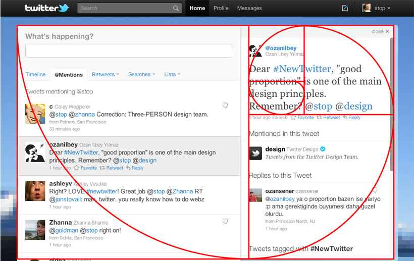
For, example, the iCloud logo is made from two pairs of circles in the Golden Ratio (1:1.6). This ratio, seen in nature very frequently as well as a number of human constructions dating back as far as the Parthenon, is often cited as a surefire, mathematical way of optimising aesthetic appeal. Leonardo Da Vinci used it in a number of his paintings and in 2010, Twitter’s redesign also relied heavily on it:
On the other side of things, we have usability, and whilst there’s no doubt that the best way to ensure your product is particularly usable is through (admittedly semi-scientific) user testing and evaluation – and by applying common patterns – what we must take into account is the fact that usability is influenced by aesthetics, as in ‘What is beautiful is good’ and therefore by simply following guidelines and organising interfaces correctly, the usability of a product will never be properly maximised.
We can safely say that usability is more scientific than aesthetics, and aesthetics more artistic than usability, however, when they meet in UX Design, finding the balance is far more of an art than it is a science – and balance is key when the relationship between the two is far from transparent.
Balance in practice
If we compare websites like those of Amazon and Apple, what we find is two highly effective pieces of UX design, but two sites that are far from similar to each other. This is because both have adapted to their priorities and user’s needs.
Amazon focus more rigorously on an informative, usable system, which is concerned with converting browsers to buyers and providing the ease of use that encourages repeat customers. Whereas Apple’s site is far more involved with maintaining the image and branding that have made Apple so successful, with its sleek lines and large white spaces – and less concerned with providing as comprehensive a shopping portal as Amazon, as Apple know that their branding and products are what sell themselves.
Amazon is not simply prioritising usability, however, and neither is Apple simply prioritising visual design. But they are instead creating their own mixes of the two based upon their priorities as companies. This is the key to the relationship between aesthetics and usability, and the key to good UX practice: to make sure that your website is designed not for what experiments suggest works, or what works best for other designers, but to achieve its primary goals for your business, and your users.
This is the second in a series of blog posts about UX Web Design. The first was Usability and Usefulness in UX Web Design.
Do you need help improving your UX? Contact Matthew, our Technical Director, today on +44 207 125 0160 or drop him a line on [email protected] for a free consultation.
Work Cited
Dion, K., Bersheid, E., Walster, E. (1972). What is beautiful is good. Journal of Personality and Social Psychology, 24 (3), 285-290
Lavie, T., & Tractinsky, N. (2004). Assessing dimensions of perceived visual aesthetics of web sites. International Journal of Human-Computer Studies 60 (3), 269-298.
Tuch, A., Roth, S., Hornbæk, K., Opwisa, K., & Bargas-Avilaa, J. (2012). Is beautiful really usable? Toward understanding the relation between usability, aesthetics, and affect in HCI. Computers in Human Behavior, 28 (5), 1596–1607.