In the last two posts we considered how to organize search results and what to do if there are no results. This post will look at what information is displayed in the individual search listing.
How we display individual search result items has a significant impact on the user in terms of how easy it is to choose the right result and the interaction that takes place.
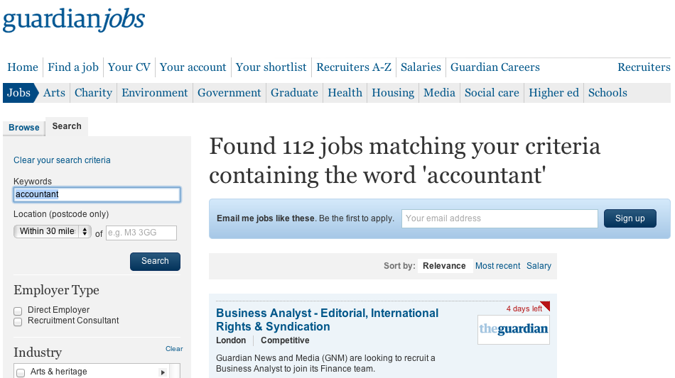
1. To begin, make sure that the search result item has a title and link to the actual page. As long as it is obvious to the user that the title is clickable, it can act as your link.
On the Guardian job search, this is achieved by displaying the title in blue:
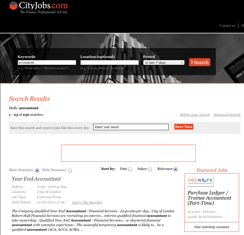
2. Include descriptions that enable users to form a judgement whether a particular result is what they are looking for. Also, consider highlighting the search term in the description.
City Jobs makes it clear how relevant a skill is to each position:
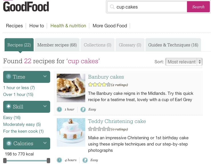
3. Include additional data that will help the user decide which result to choose, while structuring this in a way that is easy to scan.
BBC Good Food’s recipes include the average user rating, how long it takes to prepare, and the level of difficulty:
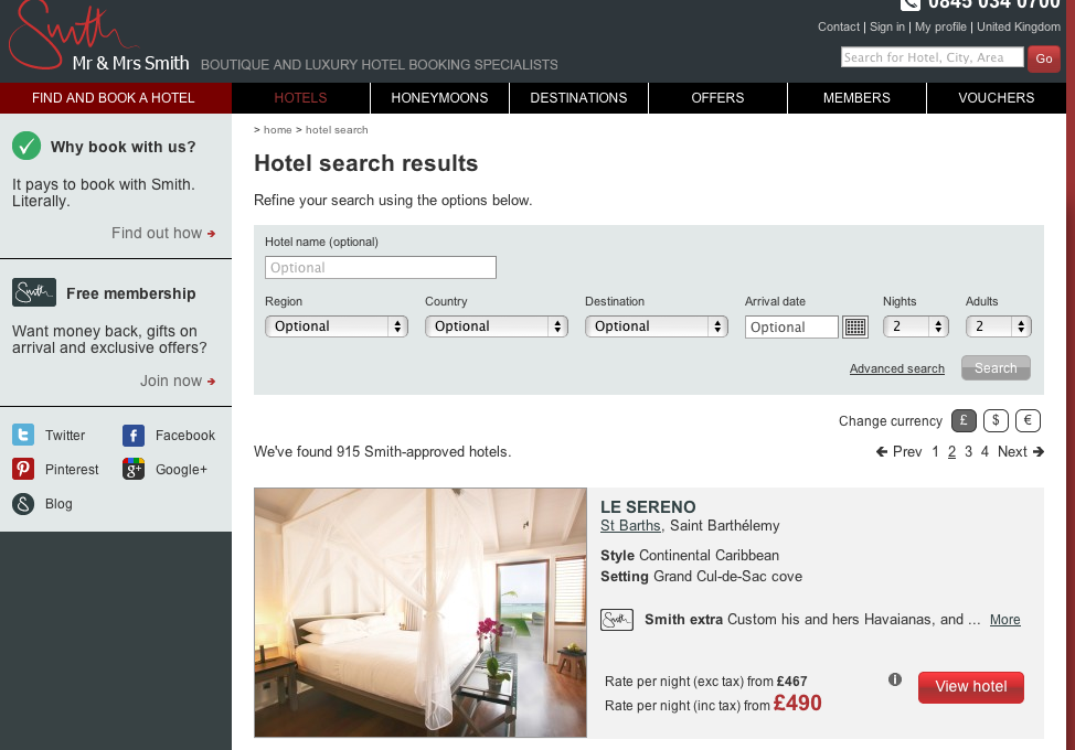
Meanwhile, Mr & Mrs Smith, a boutique hotel site, shows style, setting, extra treats and price—information that will be relevant to the users of their site.
4. Photos can be extremely helpful in letting the user scan the search results quickly and effectively. These may include room pictures for hotels, product pictures for e-commerce sites, or headshots for individuals.
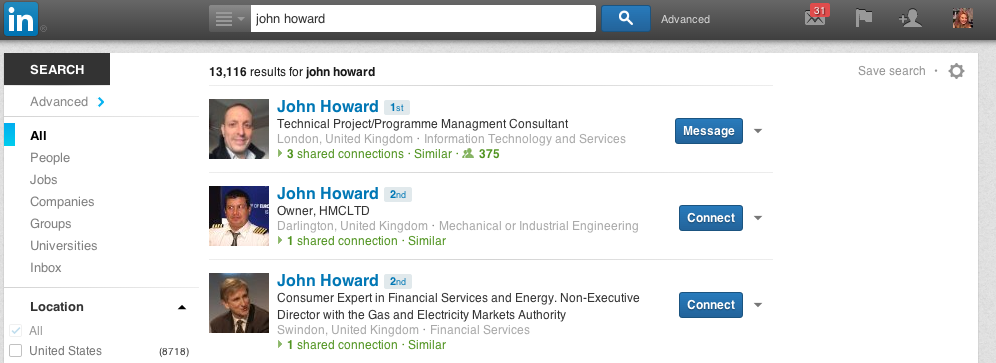
LinkedIn shows how profile pictures can help users identify the right contacts:
5. It may also be worthwhile to have either a lightbox or option to expand, so that the user can easily view additional information without having to move to the next page.
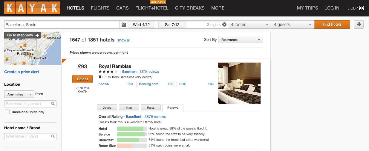
Kayak cleverly expands its results to include extra details, a map, rates, and reviews in tab format:
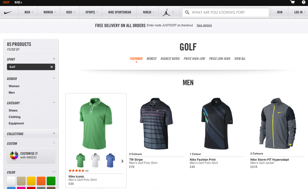
The Nike e-commerce site shows ratings and alternative colours on hover:
6. Making it possible for the user to interact with the result item.
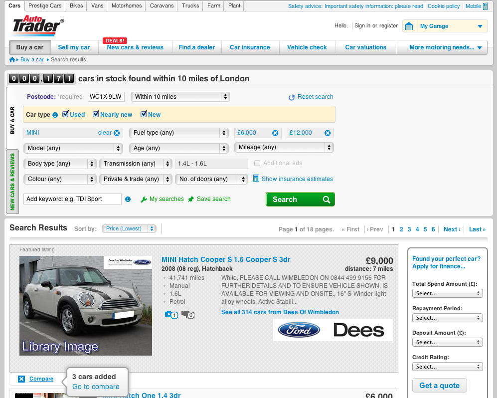
Bookmarking is the most common interaction. This may be simple bookmarking, where items are just added to “watch list”, “wish list”, a user created list or a board (in case of Pinterest) or a more sophisticated one that allows user to compare different items like in Autotrader, a car sale website:
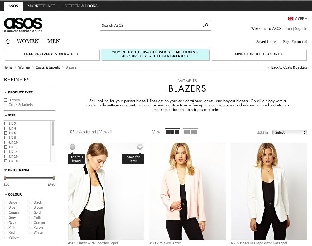
However, user interaction at item level doesn’t have to be limited to bookmarking. ASOS, an e-commerce site, allows the user to hide any brand from the search results. In effect, this is filtering:
This is the last in the series of blogs on the Search UX. If you would like to learn more about good UX practices when it comes to search, please read previous blogs in this series:
Good UX Practices When Search Returns No Results
Good UX Practices for Organizing and Filtering Search Results